August 2025 Highlights on Urban Chic Chronicles
Hey there! If you’re scrolling through our August archive, you’ve landed on three pretty different but equally useful reads. One shows you how to pick colors without overthinking, another takes a fresh look at life in the big city, and the last walks you through drug interaction charts so you can stay safe. Let’s break down what each post offers and why you might want to bookmark them.
Master the Outfit Color Rule in Minutes
The first post, “Outfit Color Rule: Simple Guide to 3-Color and 60-30-10 Styling,” is for anyone who’s ever stared at a closet and felt stuck. It explains the classic three‑color limit and the 60‑30‑10 ratio that designers swear by. You’ll learn how to pick a dominant shade (about 60% of your look), a secondary hue (30%), and an accent color (the remaining 10%). The article also drops cheat sheets you can print, plus real‑life outfit examples—from a casual denim day to a polished office ensemble. By the end, you’ll have a quick formula to build balanced outfits without endless Instagram scrolling.
Why Big City Life Is More Than Skyscrapers
The second piece, “Why Big City Life Is More Than Skyscrapers: Community, Culture, and Everyday Joy,” flips the usual skyline narrative. Instead of focusing on towers, it zooms in on the people, street markets, neighborhood festivals, and the small acts that give a city its heartbeat. The writer shares personal anecdotes from walking the Brooklyn streets, catching a sunrise on a rooftop garden, and striking up conversations at a local coffee stand. The article also outlines the trade‑offs—higher costs, faster pace—but shows how to thrive by tapping into community groups, using public spaces, and supporting local arts.
Both posts fit right into our Urban Chic vibe: style meets everyday living, and both are rooted in simplicity. Whether you’re hunting for a color combo that works or a new way to feel at home in the city, these guides give you practical steps you can try today.
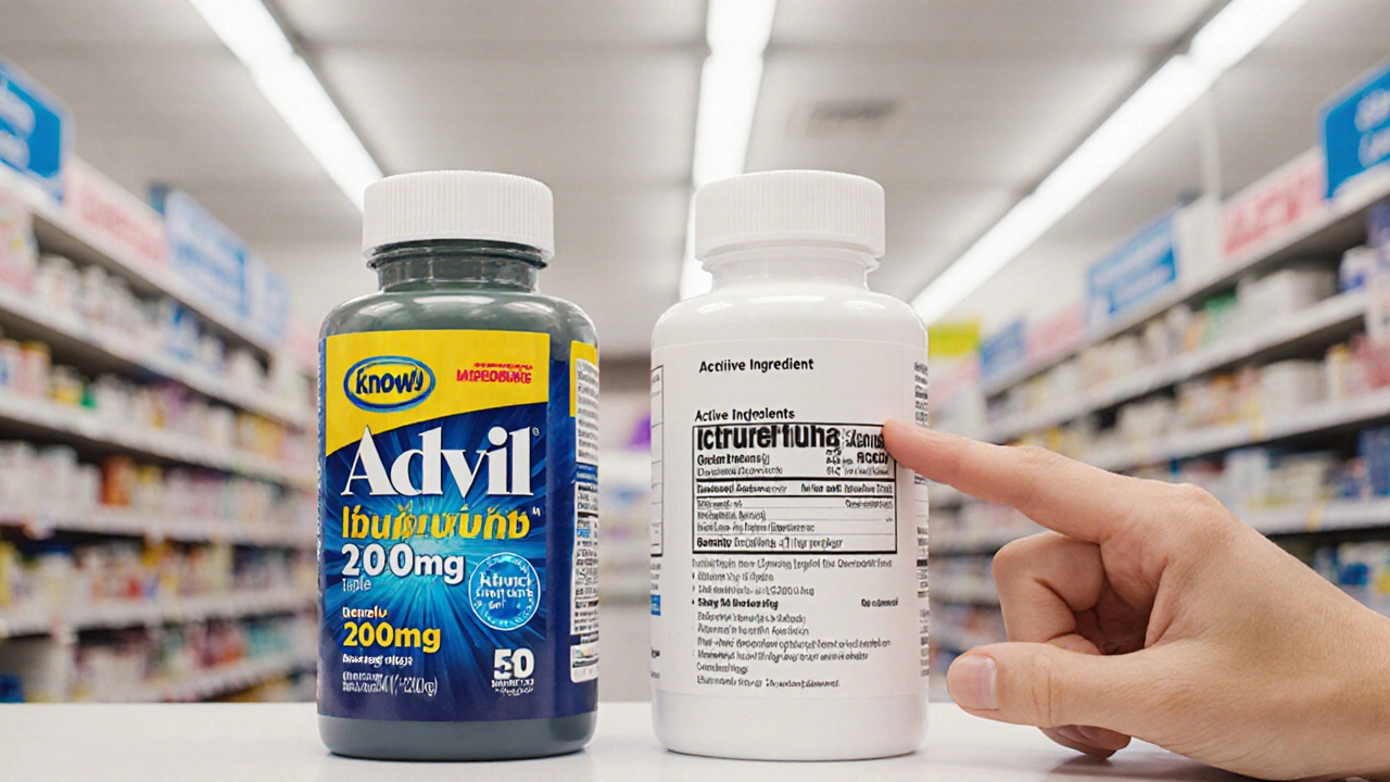
The third article, “How to Read a Drug Interaction Chart Effortlessly: Safe Medication Management Guide,” steps away from fashion and into health. It demystifies the columns, symbols, and color codes you see on most charts. You’ll learn to identify high‑risk combos (usually highlighted in red), understand moderate alerts (yellow), and spot safe pairings (green). The guide includes a printable chart legend, a checklist for your pharmacy visits, and tips on talking to doctors about potential interactions. The tone is friendly, so even if you’ve never looked at a chart before, you’ll feel confident navigating it.
What ties all three posts together is the focus on clear, actionable advice. We keep the language straightforward, give you tools you can print or copy, and make sure every tip can be tried right away. So, if you’re looking to upgrade your wardrobe, feel more connected to your city, or manage your meds without headaches, this August archive has you covered.
Take a minute to skim the headlines, click the one that catches your eye, and start applying the tips. We’ll keep adding fresh takes on style, city life, and wellness, so check back often for more practical inspiration.
Outfit Color Rule: Simple Guide to 3-Color and 60-30-10 Styling
Posted by Kayla Susana on Aug, 25 2025

Confused by colors? Learn the outfit color rule: 3 colors max + 60-30-10 balance. Clear steps, easy formulas, cheat sheets, and real-life examples.
Why Big City Life Is More Than Skyscrapers: Community, Culture, and Everyday Joy
Posted by Elias Hartfield on Aug, 11 2025

Big city life runs on people, not buildings. Here’s how to see the human side-community, culture, costs, trade-offs-and how to thrive at street level.
How to Choose Drugs by Active Ingredient
Posted by Eamon Lockridge on Aug, 9 2025
Learn how to choose the right medication by focusing on the active ingredient instead of brand names. Save money and get the same results with generic drugs.