Most outfits don’t fail because of bad clothes. They fail because the colors fight each other. If you want outfits that look intentional without dressing like a stylist, you need one idea: the outfit color rule. It’s a simple set of guardrails-use up to three colors and split them by visual weight (60-30-10) so your look feels balanced, not chaotic. No art degree required. Just a few quick checks before you leave the house.
TL;DR: The Outfit Color Rule, Explained
outfit color rule = Keep your palette tight so your look feels cohesive, not noisy.
- Use the 3-color rule: no more than three colors visible at once (neutrals count, prints count).
- Balance them with 60-30-10: one dominant color (~60%), one supporting (~30%), one accent (~10%).
- Neutrals are your base: black, white, gray, navy, beige, olive, denim. Treat denim as a neutral.
- Match contrast to your setting and your features: high contrast is bold; low contrast is minimalist.
- When unsure: two neutrals + one color. Shoes and bag do not have to match-just live in the same palette.
You likely clicked for a few specific jobs-to-be-done. Here’s what we’ll knock out:
- Learn what the rule is and why it works fast.
- Get a step-by-step method to build an outfit from your closet.
- Grab easy color recipes and a cheat sheet you can screenshot.
- See real examples for work, dates, weekends, weddings, and streetwear.
- Fix common issues: too loud, too flat, or not coordinated.
Build It Step by Step: From Blank Canvas to Balanced Outfit
Think of your outfit like a room. You pick a wall color (dominant), furniture (supporting), and decor (accent). Same idea here, just faster.
-
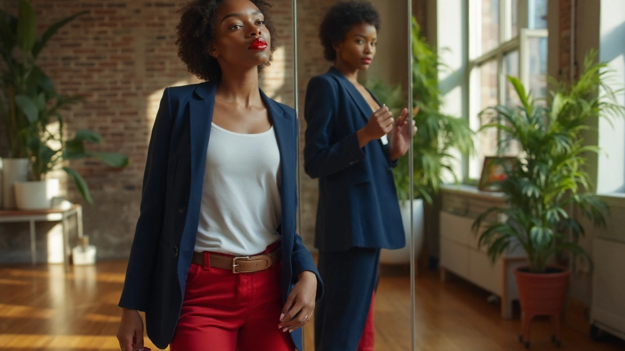
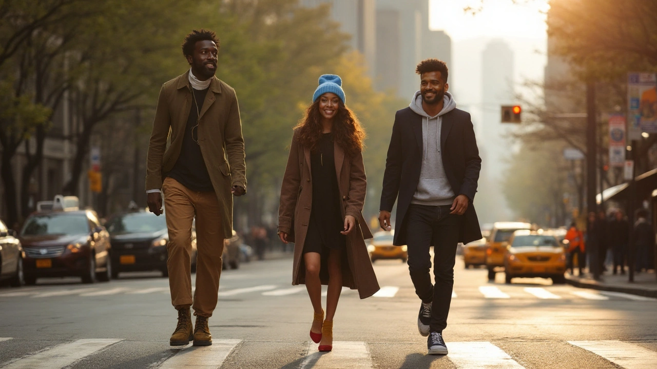
Choose your base neutral (the 60%). This is your anchor: pants or skirt, dress, or outer layer. Pick from black, navy, gray, beige, white, olive, or denim. In New York, black is the unofficial uniform for a reason-easy, city-proof, and it plays well with everything. If you want softer, use navy or gray.
-
Add one supporting color or neutral (the 30%). This can be another neutral (like beige with navy) or a calm color (sage, dusty blue, wine). You’re building the backdrop. If your base is dark, try a mid-tone for contrast. If your base is light, try mid-to-dark.
-
Finish with one accent (the 10%). A pop: a tee, scarf, bag, hat, lips, nails, or sneakers. Jewelry and metal hardware usually live in the 10%. A clean white tee can be the “accent” if the rest is darker.
-
Check the count. Do a quick scan: do you see more than three distinct colors? Tiny repeats in prints are fine, but if the eye catches a fourth and fifth color, tuck or swap one piece.
-
Balance contrast for mood and context. High-contrast outfits (black and white, navy and white) read sharper and louder. Low-contrast outfits (cream + beige + tan) read calm and luxe. For a job interview, one crisp contrast point is enough (e.g., navy suit + light blue shirt + brown shoes). For date night, add an accent that links back (bag and lipstick in the same family).
-
Use the color wheel when you want extra punch. Three easy harmonies from classic color theory (Johannes Itten’s color wheel still works great):
- Complementary (opposites): blue with orange, red with green, purple with yellow. Use one as accent to avoid clashing.
- Analogous (neighbors): blue + teal + green; red + orange + camel. Smooth, easy on the eyes.
- Triadic (triangle): red + yellow + blue. Best with two muted, one bright.
-
Prints and graphics “count.” A floral skirt with navy, blush, and green already uses three colors. Pair it with a neutral top and shoes that match one color from the print. Graphic tees? Treat the ink color as part of the palette.
-
Mind undertones without overthinking. Warm colors (camel, rust, olive) flatter warm undertones; cool colors (charcoal, cobalt, fuchsia) flatter cool undertones. If your veins look greenish, you may lean warm; blue/purple veins often lean cool; if it’s mixed, you’re likely neutral. These are guides, not laws. Fit and balance beat undertone theory any day.
-
Texture changes the game. When you keep colors minimal, add texture-ribbed knits, suede, patent, boucle, raw denim. Texture creates depth so monochrome outfits don’t feel flat.
-
Consider light and season. Daylight cools colors; warm indoor bulbs add yellow. On a gray NYC winter morning, you can go one shade brighter to avoid looking washed out. In peak summer sun, lighter colors and low contrast feel fresh.
Why this works: your brain likes patterns. Three colors make a pattern your eye can follow; the 60-30-10 split helps your eye know where to land first. Design and interior pros use the same ratio because it’s fast and reliable. Pantone’s seasonal reports track what colors feel current, but the ratio keeps outfits timeless even when the hues change.
Quick pro tips:
- Metal counts: pick one dominant metal (gold or silver). Mixing is fine if one clearly leads.
- White sneakers behave like “bright neutrals.” They can be your accent or part of your 30%.
- Denim-on-denim works if washes differ. Light denim jacket + mid-wash jeans + white tee = 2 colors, 1 accent.
- Navy and black can co-exist. Make the contrast intentional with texture (black leather + navy wool) or a bright accent.
- Red is high attention. You only need a small piece-lip, bag, cap-if you want it to lead.
Real-World Recipes, Cheat Sheets, and a Quick-Scan Table
Here are color formulas you can copy, tweak, and repeat. Think of them as plug-and-play palettes.
Everyday uniform (errands, coffee runs):
- Navy (60) + gray (30) + white (10): Navy jeans, gray hoodie, white sneakers. Clean and invisible in the best way.
- Black (60) + denim (30) + red (10): Black trousers, denim shirt, red cap or lip. City simple with a wink.
Office-smart:
- Charcoal (60) + light blue (30) + brown leather (10): Suit, shirt, belt/shoe. Conservative but not boring.
- Navy (60) + ivory (30) + burgundy (10): Navy dress, ivory blazer, burgundy bag.
Date night:
- Black (60) + black (30) + metallic (10): All-black with gold earrings or a silver bag. Texture is key-matte + satin + leather.
- Chocolate (60) + cream (30) + teal (10): Rich, warm, a little unexpected.
Weekend/casual street:
- Olive (60) + white (30) + orange (10): Cargo pants, white tee, orange beanie.
- Beige (60) + stone gray (30) + cobalt (10): Neutral set with a pop sneaker.
Weddings and events (guest):
- Dusty rose (60) + champagne (30) + nude (10): Dress, shawl, shoes. Soft, photogenic.
- Navy (60) + sage (30) + blush (10): Works across seasons and venues.
Monochrome gradient (same color, different shades):
- Cream (60) + beige (30) + tan (10): Luxe, low-contrast, very 2025.
- Light gray (60) + mid gray (30) + charcoal (10): Add suede or knit for depth.
Fast decision tree (when your brain is fried at 7am):
- Do I need to look sharp? Pick navy or black base.
- Am I okay with attention? If yes, add a bright accent; if no, stay with two neutrals.
- Will I be photographed? Add one clear contrast point (light vs dark) so you don’t blur into the background.
- Is the outfit flat? Add texture before adding another color.
Color psychology, briefly: Blue consistently tops “most liked” charts in global surveys (YouGov), which is why navy feels safe. Red pulls focus and signals energy-use small doses unless you want the whole look to shout. Green sits in a restful zone, especially olive and sage. These aren’t rules, just useful tendencies backed by lots of consumer research and visual ergonomics work.
Use this table to mix fast:
| Harmony/Formula | Base (60%) | Support (30%) | Accent (10%) | Vibe | Best For | Common Pitfall |
|---|---|---|---|---|---|---|
| Two Neutrals + One Pop | Navy | Gray | Yellow | Smart with energy | Office, casual Friday | Pop too big (over 10%) steals the look |
| Complementary | Olive | Beige | Red | Earthy with a spark | Weekends, streetwear | Using full-saturation red-mute it or keep it small |
| Analogous | Teal | Blue | Navy | Calm gradient | Work, travel | All pieces same value-add texture or one lighter piece |
| Monochrome Gradient | Light Gray | Mid Gray | Charcoal | Minimal, luxe | Gallery nights, dinners | Feels flat-fix with knit/suede/leather mix |
| Triadic (Muted) | Navy | Mustard | Brick Red | Retro-modern | Creative offices | Too bright in all three-mute two, let one pop |
| All-Neutral | Black | Charcoal | White | Crisp, urban | Anytime, anywhere | Harsh if fabrics all shiny-mix finishes |
Seasonal notes (2025, big picture): fashion color trend reports this year leaned into digital lilac, butter yellow, soft clay, and lagoon blue. If you want to feel current without replacing your closet, plug one of those into your accent slot. The ratio does the heavy lifting so your look stays grounded.
Warm vs cool capsule starters (build-these wardrobes):
- Warm-leaning: camel, olive, cream, chocolate, rust. Accents: teal, coral, mustard.
- Cool-leaning: navy, charcoal, white, slate, dusty blue. Accents: fuchsia, cobalt, emerald.
- Neutral-leaning: beige, gray, denim, black, ivory. Accents: red, lilac, forest.
A note on black: In NYC, black-on-black is a lifestyle. It works because the fabrics vary (knit + leather + wool) and the whites of your eyes/teeth create natural contrast. If it feels severe, swap in charcoal or add a cream accent somewhere small.
Quick Answers, Fixes, and What to Do Next
Mini-FAQ
- What exactly counts as a “color”? Anything your eye reads as a different hue or value. Yes, shades of the same color can count as separate if the contrast is strong.
- Do shoes and bag need to match? No. They need to live in the same palette. Brown shoes can sit with a black bag if the outfit ties them with another brown or black element.
- Does white after Labor Day matter? Not in 2025. Winter white (cream, ivory) looks refined in cold months.
- Is denim a color or a neutral? Treat denim like a neutral. Keep the wash in mind: very light denim behaves like a light neutral; raw indigo behaves like navy.
- What about black and navy together? Yes-make it obvious and intentional. Add texture, a belt, or a white tee to separate them.
- How do prints fit the 3-color rule? Count the three most visible colors in the print as your full palette. Anchor with neutrals that repeat one of those colors.
- What if my undertone advice conflicts with what I like? Wear what you love. If a color fights you near the face, push it to pants, shoes, or a bag.
- Can I wear more than three colors? Sure, if you keep them muted and close in value, or if the extra colors are micro-details. But if the outfit looks busy, you’ve got your answer.
- Is gold or silver “a color”? Metals read like color if they’re dominant. Pick one main metal and keep other metal touches minimal.
- Any fast way to test balance? Take a mirror selfie and squint. The biggest block you notice should be your 60%. If your accent looks as big as your base, something’s off.
Troubleshooting by symptom
- Outfit feels too loud: Reduce saturation or reduce count. Swap a bright top for a neutral. Keep the pop in shoes or a bag.
- Outfit feels flat: Add texture first (suede, knit, rib, quilt). If still flat, add one contrast point-a white tee under a dark jacket.
- Colors don’t coordinate: Find a bridge piece. A belt or scarf that includes both colors fixes it. Or choose an accent that sits between them on the color wheel.
- Black washes me out: Use navy or charcoal near your face, keep black on bottom, or add a warm accent (camel, gold earrings, peachy blush).
- Can’t pick a pop color: Use your lip or nail color. They’re built-in accents that repeat easily.
- Looks messy with mixed metals: Let one metal lead. Repeat it twice (earrings + belt buckle), keep the other as a tiny detail.
- Unsure about a bold shoe: Repeat its color once up top (hat, tee graphic, lipstick). One repeat makes it intentional.
Next steps you can do today
- Pick your base trio of neutrals: choose three you’d wear year-round (e.g., navy, gray, white).
- Choose two accent families you love: maybe red and teal, or lilac and forest. Buy small pieces in those accents first.
- Audit your closet with the 60-30-10 lens: Which pieces do you actually use as base vs support vs accent? You may be low on base pieces.
- Make a 5-outfit grid: Write five quick recipes on your phone using your neutrals and accents. Example: Navy pants + gray knit + white sneaker (repeat weekly).
- Shoot mirror pics: Compare what feels balanced. Switch to grayscale on your phone-if the image looks like one gray blob, add contrast or texture.
Common pitfalls (and fixes):
- Exact match obsession: Trying to match reds perfectly will drive you nuts. Aim for harmony, not identical twins. Keep one red the lead and let the other be a shade lighter or darker.
- Too many brights: Bright hat + bright jacket + bright shoes reads costume. Keep two brights? Make them neighbors on the wheel and dim one to mid-tone.
- Ignoring fabric shine: Satin and patent act like color because they catch light. If your palette is neutral, too much shine can overwhelm. Balance with matte pieces.
- Over-printing: One big print per outfit is plenty. If you add a second, make it micro and in the same color family.
- Season mismatch: Butter yellow that looked sunny in July can look pale in January. Pair it with richer support (camel, chocolate) when it’s cold.
If you forget everything: hold onto two formulas. 1) Two neutrals + one color. 2) 60-30-10. If you hit both, your outfit will look pulled together 9 days out of 10.
Bonus: quick pairing sparks
- Forest + charcoal + cream
- Wine + navy + gray
- Clay + camel + white
- Cobalt + beige + tan
- Lavender + stone + navy
Why the rule sticks: It’s not fashion fluff. It’s borrowed from visual hierarchy in design, where 60% guides the eye, 30% supports, and 10% delights. Pantone notes change every season; the ratio never does. Once you see outfits this way, you can play with any color and still look intentional-even when you break the rule on purpose.
One last New York-tested tip: if your day runs from subway to office to dinner, let your accent be the piece that comes off or goes on. A scarf, a lip, a hat-you can dial your volume up or down without changing the base. That’s how you stay ready for anything without hauling a second outfit.