Have you ever looked in the mirror and felt like your favorite shirt just doesn’t look right anymore? Not because it’s outdated, but because the color seems off-too harsh, too dull, or just plain wrong? You’re not imagining it. As we age, our skin changes. The way light hits it, how it absorbs color, and how contrast affects our features all shift. What looked vibrant at 25 might look washed out at 55. The good news? You don’t need to overhaul your wardrobe. You just need to tweak the brightness and contrast of your colors.
Why Colors Change With Age
Your skin loses some of its natural luminosity over time. Collagen drops. Blood flow slows. Melanin distribution becomes uneven. These aren’t flaws-they’re biology. And they change how color interacts with your face.
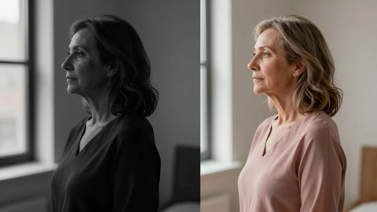
Think of your skin like a canvas. When you’re younger, it’s smoother, more reflective. Bright, saturated colors bounce off it and look electric. By your 40s and 50s, that surface becomes more matte. Harsh reds or electric blues can now look like they’re screaming against your skin. Meanwhile, muted tones start to look richer, deeper, more natural.
A 2023 study from the Skin Health Institute in Boston found that people over 50 perceive color contrast differently. They need 20-30% less saturation to feel the same level of vibrancy. That means a fuchsia top that once made you glow might now look like a neon warning sign. But a dusty rose? That’s the sweet spot.
Three Simple Rules for Flattering Color Adjustments
You don’t need a personal stylist. You just need to remember three rules:
- Lower saturation, raise contrast-Avoid neon, but don’t go full gray. Instead, pick colors with depth, like plum, forest green, or navy. These have low saturation but high contrast against skin.
- Match your undertone, not your mood-If you’ve always thought you’re a “summer,” but your skin now looks better in warm golds than icy pastels, it’s time to adjust. Undertones don’t change. But how they react to light does.
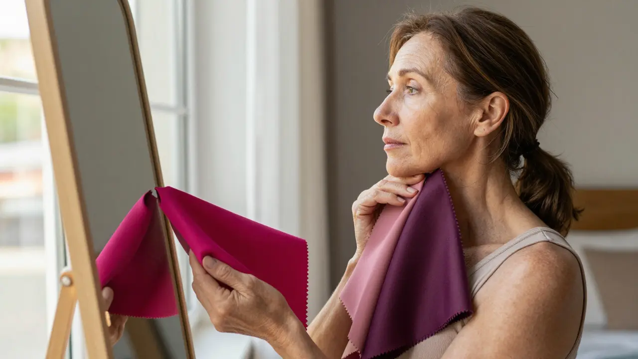
- Test colors near your face-Hold fabric up to your jawline, not your hand. Your neck and face are the real canvases. A color that looks great on your arm might clash with your skin tone.
What to Wear: Color Guide by Undertone
Here’s what works best for common undertones after 45:
| Undertone | Colors to Avoid | Colors That Flatter | Why It Works |
|---|---|---|---|
| Warm (golden, peachy) | Electric blue, cool pastels | Brick red, olive green, mustard, warm taupe | These mirror the natural warmth in your skin, creating harmony instead of clash. |
| Cool (pink, rosy) | Orange, bright yellow | Deep plum, charcoal gray, royal blue, soft lavender | They enhance the natural coolness without washing you out. |
| Neutral (mix of warm and cool) | Overly bright white, neon green | Soft navy, camel, muted rose, slate | They’re balanced enough to work with both undertones without overpowering. |
Notice how none of these are “boring”? Muted doesn’t mean dull. A deep plum is richer than a hot pink. A charcoal gray has more texture than a white tee. The key is depth-not dimness.
Contrast Is Your Secret Weapon
Contrast isn’t just about light vs. dark. It’s about how much your clothing stands out from your skin tone. Too little? You look washed out. Too much? You look like you’re wearing a costume.
For most people over 50, medium contrast is ideal. That means:
- Pairing a soft gray top with navy pants
- Wearing a camel coat over a muted rose sweater
- Choosing a taupe blazer with a cream blouse
Avoid high-contrast combos like black and white unless you’re going for a dramatic look. They can emphasize fine lines and make skin look more tired. Instead, lean into tonal layering-colors that sit close on the color wheel. It’s elegant. It’s effortless. And it’s ageless.
Accessories That Do the Heavy Lifting
You don’t need to repaint your whole closet. Sometimes, it’s just the accessories that make the difference.
Try swapping out silver jewelry for gold or rose gold if you’ve noticed your skin looks warmer now. A silver necklace might have looked chic in your 30s, but now it can make your skin look ashy. Gold? It reflects warmth and adds glow.
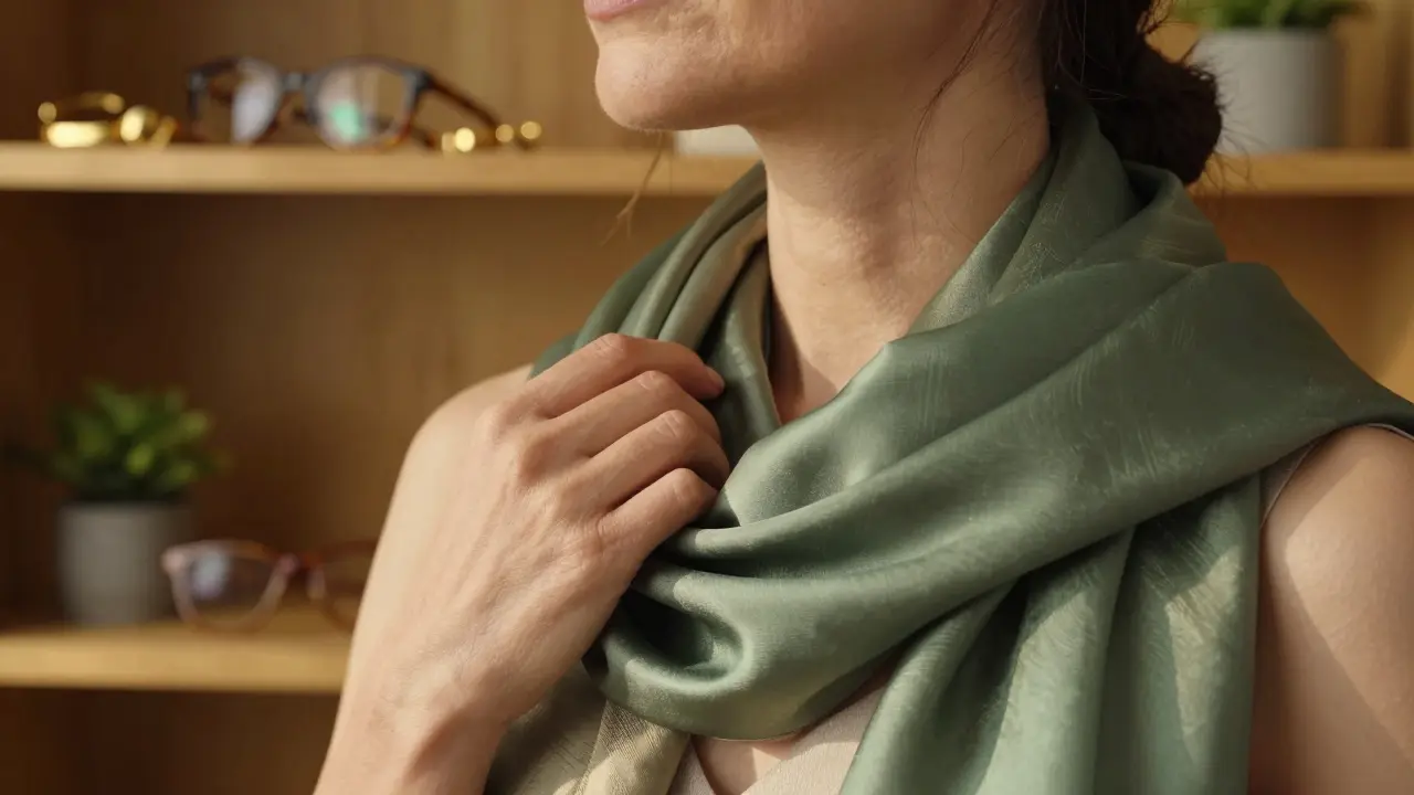
Scarves are underrated. A silk scarf in a muted terracotta or moss green can instantly lift your face. Drape it loosely around your neck-it draws attention upward, away from sagging lines, and adds subtle color without overwhelming.
Even your eyeglass frames matter. If your frames are black or dark brown, try switching to tortoiseshell or bronze. They reflect more light and soften your features.
Testing Colors at Home
Here’s a simple trick I use every season:
- Take three shirts: one bright, one muted, one neutral.
- Put them on one after another in natural daylight-near a window, not under fluorescent lights.
- Take a photo of each. Step back. Look at them on your phone.
- Which one makes your eyes look brighter? Which one makes your skin look more even?
- Keep that one. Donate the rest.
You’ll be surprised how often the “safe” color is the one that actually makes you look more alive.
What About Patterns?
Patterns aren’t off-limits. But they need to be softer.
A small, low-contrast print-like a subtle houndstooth in taupe and gray-works beautifully. A bold, high-contrast floral? That’s a recipe for visual noise. It distracts from your face instead of enhancing it.
Look for patterns where the colors are within one or two tones of each other. That creates rhythm, not chaos.
Real-Life Example: A New York Wardrobe Makeover
A client in her early 60s came to me saying she felt invisible. She wore mostly black, white, and gray-colors she’d worn for decades. She looked tired. We swapped her black turtleneck for a deep burgundy one. Her gray coat became a charcoal wool with a hint of brown. Her white blouse? Replaced with a soft ivory.
Within a week, she got three compliments-not on her outfit, but on how “glowing” she looked. She didn’t change her style. She changed the quality of her color.
Final Thought: It’s Not About Looking Younger
This isn’t about hiding age. It’s about honoring it. Your skin has stories. Your eyes have history. The right colors don’t mask them-they highlight them.
When you choose colors that work with your current skin, you don’t just look better. You feel more like yourself. More confident. More present.
Try one change this week. Swap one item for a color with lower saturation and higher depth. Notice how you feel. You might just rediscover your favorite version of yourself.
Why do colors look different on my skin now compared to when I was younger?
As we age, our skin loses collagen, becomes thinner, and produces less natural oil. This changes how light reflects off it. Bright, saturated colors that once looked vibrant can now appear harsh or washed out because your skin no longer reflects light the same way. Muted, deeper tones create better contrast and harmony with mature skin.
Should I stop wearing black if I’m over 50?
No-you don’t need to give up black. But wearing it head-to-toe can make skin look dull. Instead, use black as an accent. Pair it with a softer color like camel, rust, or deep teal. That way, you get the structure of black without the flatness. Black with contrast works. Black alone often doesn’t.
Is it true that gold jewelry looks better than silver after 45?
For many people, yes. As skin loses pink undertones and gains warmth, silver can make it look ashy or gray. Gold and rose gold reflect warmer light, which complements the natural tones in mature skin. But if you’ve always looked great in silver and your skin still feels cool-toned, keep wearing it. It’s about your skin, not the trend.
How do I know if I have warm, cool, or neutral undertones?
Look at the veins on your wrist under natural light. If they look greenish, you’re likely warm. If they look blue or purple, you’re likely cool. If they look both, you’re neutral. Another test: put on a white shirt and a cream shirt. Which one makes your skin look more even? White usually suits cool tones. Cream suits warm and neutral. You can also try holding gold and silver jewelry to your jawline-the one that makes your skin glow is your match.
Can I still wear prints after 50?
Absolutely-but choose prints with low contrast. Avoid bold black-and-white florals. Instead, look for small patterns in tonal shades-like navy on charcoal, or rust on mustard. These add texture without visual noise. The goal is to enhance your face, not compete with it.


Write a comment