Ever put together an outfit that looked great in your head but ended up looking muddy, clashing, or just plain off in the mirror? You’re not alone. Most people struggle with color combinations-not because they don’t have taste, but because they’re missing simple, repeatable formulas. The good news? You don’t need to be a designer to pull off colors that work. There are proven two-color and three-color outfit strategies that always look intentional, polished, and flattering-no guesswork required.
Why Color Combining Feels So Hard
Color theory sounds complicated because it’s often taught with terms like "complementary" and "analogous"-words that feel more at home in an art class than in your closet. But real-life color coordination doesn’t need a degree in design. It needs structure.
Here’s the truth: most people fail at color combining because they try to match too many shades at once, or they pick colors based on what’s trendy, not what works together. A navy blazer doesn’t go with every shade of blue. A burgundy sweater doesn’t automatically look good with olive pants. There’s a system behind what looks right-and it’s not magic.
Think of your outfit like a song. One note can be strong. Two notes can create harmony. Three notes can build depth. Too many notes? Noise. The goal isn’t to wear every color you own. It’s to pick a few that sing together.
The Two-Color Outfit Formula That Works Every Time
Two-color outfits are the secret weapon of people who look put-together without trying. They’re simple, modern, and universally flattering. Here’s the rule: pick one dominant color and one supporting color that are at least two steps apart on the color wheel.
Let’s break that down with real examples:
- Charcoal gray + cream: Classic, clean, and works for work or weekend. Charcoal is cool and deep; cream is warm and soft. They balance each other.
- Forest green + rust: Earthy and rich. Perfect for fall. Neither color is neutral, but together they feel grounded, not chaotic.
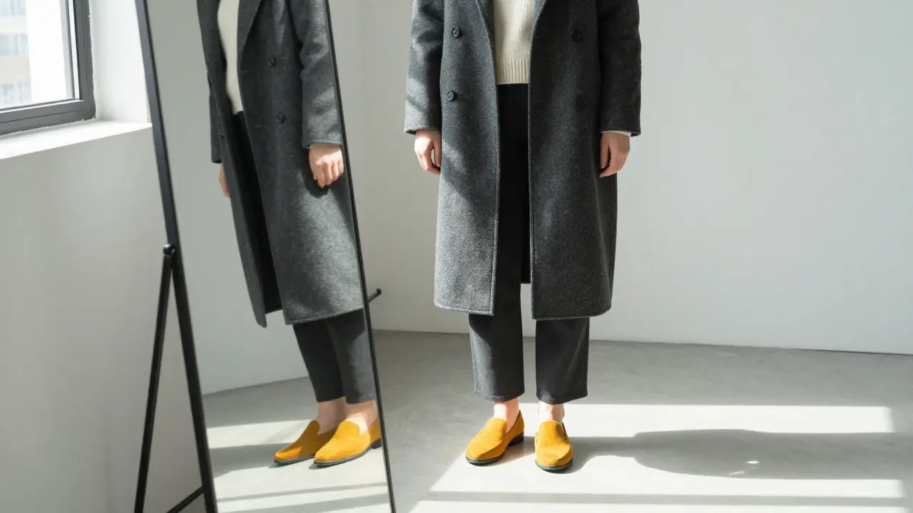
- Black + mustard yellow: High contrast, bold, and modern. Black anchors the mustard so it doesn’t overwhelm.
The trick? Let one color take up 70% of the outfit and the other 30%. That’s the 70/30 rule. If you’re wearing a black coat, make your scarf or shoes the mustard. If you’re in a cream sweater, go with charcoal pants-not the other way around.
And here’s the golden rule for two-color combos: avoid two colors that are the same temperature unless one is neutral. Warm + warm (like coral and peach) can look washed out. Cool + cool (like navy and icy blue) can look flat. But cool + warm? That’s where the magic happens.
Three-Color Outfits: How to Add Depth Without Chaos
Once you’re comfortable with two colors, adding a third feels intimidating. But it doesn’t have to be. The key is hierarchy: one main color, one secondary color, and one accent.
Use the 60/30/10 rule:
- 60% dominant color: Your base. Pants, skirt, dress, or coat.
- 30% secondary color: Balances the dominant. Top, jacket, or layer.
- 10% accent color: Pops. Shoes, bag, jewelry, or scarf.
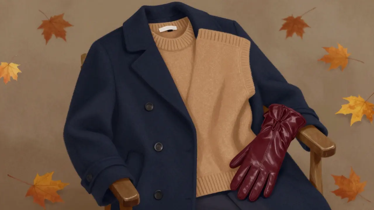
Here’s a real-life example that works for a Chicago winter:
- 60% navy wool coat
- 30% camel wool sweater
- 10% burgundy leather gloves
Why this works: Navy is cool and strong. Camel is warm and neutral. Burgundy adds richness without being loud. All three colors are muted, which keeps it sophisticated. No neon, no patterns, no confusion.
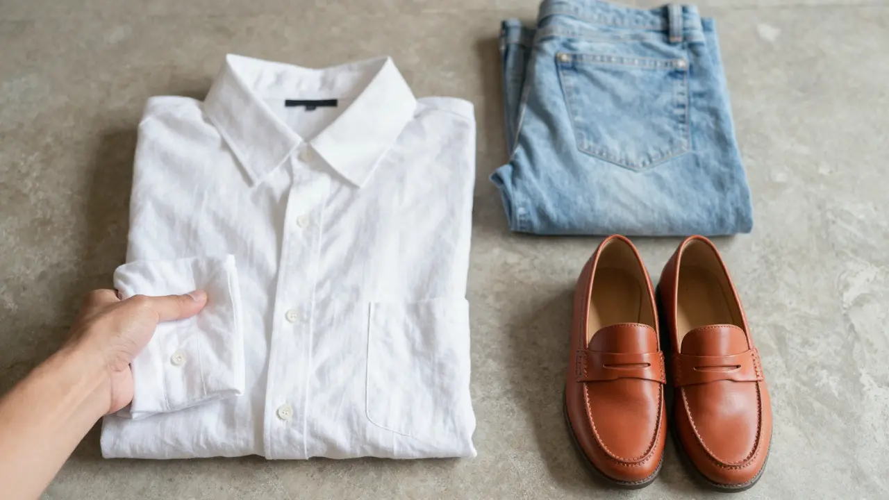
Another combo for spring:
- 60% white linen shirt
- 30% light blue jeans
- 10% terracotta loafers
White and blue are a classic duo. Terracotta brings in warmth and ties into the season. The accent color doesn’t compete-it completes.
What Colors Actually Go Together (No Guessing)
You don’t need to memorize color wheels. Just remember these three foolproof pairings:
- Neutrals + one muted tone: Black, white, gray, beige, navy, or camel paired with dusty rose, sage green, or slate blue. Always safe. Always elegant.
- Warm neutrals + warm earth tones: Cream + rust, camel + olive, tan + burnt sienna. Perfect for fall and winter. Feels cozy, not matchy.
- Cool neutrals + cool jewel tones: Navy + emerald, charcoal + plum, white + teal. Clean, crisp, and modern. Great for spring and summer.
These combinations work because they share the same undertone. Mixing warm and cool tones in the same outfit is fine-as long as one is neutral. That’s why navy (cool) and camel (warm) look great together. But two warm tones like red and orange? That’s a risk unless one is very muted.
Common Mistakes (And How to Fix Them)
Here are the three most common color errors-and how to avoid them:
- Mistake: Wearing two bright colors together (e.g., red top + orange skirt). Fix: Replace one with a neutral. Swap the orange for gray or beige.
- Mistake: Wearing a patterned item with a busy color. Fix: If your shirt has stripes, keep the pants solid. If your coat has texture, keep the scarf simple.
- Mistake: Thinking black and brown can’t go together. Fix: They can-just make sure one is darker than the other. Dark brown boots with a black coat? Perfect. Light brown belt with black pants? Too close. Go darker or lighter.
Another quick tip: if you’re unsure, hold your outfit up next to a neutral wall. Does it look like a cohesive whole? Or does one piece scream for attention? If the latter, you’ve got too much going on.
How to Build Your Personal Color Palette
Everyone has colors that make their skin glow and others that make them look tired. You don’t need a professional color analysis to find yours. Try this:
- Wear a white shirt and stand in natural light.
- Hold up a gold necklace and a silver necklace one at a time.
- Which one makes your skin look brighter? Gold? You’re likely warm-toned. Silver? You’re likely cool-toned.
Warm-toned people look best in: beige, rust, olive, mustard, coral, terracotta, cream.
Cool-toned people look best in: navy, charcoal, plum, teal, icy pink, lavender, white.
Neutral-toned? You can wear both. Stick to muted versions of everything.
Once you know your tone, build your wardrobe around three base colors that suit you. Then add one or two accent colors you love. That’s your personal palette. Stick to it, and every outfit will look intentional.
What to Do When You’re Stuck
Staring at your closet and nothing looks right? Try this five-minute trick:
- Pick one item you love (a jacket, a dress, a pair of shoes).
- Find one color in it that’s not black, white, or gray.
- Look for another item in your closet that has that same color.
- Pair them. Add a neutral if needed.
Example: You love your mustard yellow scarf. You find a pair of cream trousers. You grab a navy coat. Done. Three colors. One formula. Looks expensive.
Or use your phone. Take a photo of your outfit. View it in black and white. If the tones still look balanced, you’re good. If everything looks flat or muddy, adjust.
Final Rule: Less Is More, But More Is Okay-If It’s Controlled
You don’t need to wear only two or three colors every day. But you do need to control the chaos. A floral dress with five colors? Fine-if the background is white or black and the print is muted. A patterned blazer with a striped shirt and colorful pants? Not fine.
Control means one bold element. The rest? Neutral, simple, or tonal.
Color combining isn’t about rules. It’s about confidence. Once you know what works, you stop second-guessing. You stop buying things that don’t go with anything. You stop feeling like your wardrobe is a mess.
Start with one two-color combo this week. Then try one three-color outfit. Notice how people react. Notice how you feel. That’s the real test-not the color wheel.
Good color isn’t about trends. It’s about harmony. And harmony always looks expensive-even if you bought everything on sale.
Can I wear two warm colors together?
Yes, but only if one is neutral. Warm + warm like rust and coral can look muddy unless one is very muted-think beige or camel. Stick to one bold warm tone and pair it with a neutral (cream, camel, or gray) to keep it balanced.
Do I need to match my belt to my shoes?
Not anymore. That rule is outdated. What matters is that both are in the same color family. A dark brown belt with black shoes works fine. A tan belt with dark brown boots? Even better. The key is avoiding clashing tones-like navy shoes with a bright red belt.
What if I only own black, white, and gray?
You can still create depth. Add texture-knits, wool, leather, linen. Layer pieces with different finishes. A gray wool coat over a white cotton shirt with black leather pants looks rich because of texture, not color. Add a single accent piece-like a rust scarf or navy bag-and you’ve instantly upgraded your look.
How do I know if a color suits my skin tone?
Hold up gold and silver jewelry in natural light. If gold makes your skin glow, you’re warm-toned. If silver does, you’re cool. Warm tones look best in earthy colors (rust, olive, cream). Cool tones look best in jewel tones (navy, plum, teal). Neutral tones can wear both-just avoid overly bright or neon shades.
Can I use patterns in my color combos?
Yes-but treat the pattern as one color. If your shirt has navy, white, and red stripes, pick one of those colors to match your pants. Don’t try to match all three. Keep the rest of your outfit simple. A striped shirt with solid navy pants and white sneakers? Perfect. A striped shirt with plaid pants? Too much.


Write a comment