

You know that feeling when you buy a shirt because it looks amazing on the hanger, but once you put it on, your face looks gray? Or maybe you wear a black turtleneck every day, thinking it’s slimming, only to realize it makes you look tired by 2 PM. It’s not bad luck. It’s physics. Specifically, it’s Color Theory applied to personal styling and fashion design. Most people think color is just about liking blue or hating red. But if you want to actually improve how you look, you need to stop guessing and start understanding the three pillars of color: Hue, Saturation, and Value.
This isn’t about turning into an artist who mixes paints. This is about hacking your wardrobe so that clothes work for your skin tone instead of fighting against it. By the end of this guide, you’ll know exactly why certain colors make you glow and others wash you out, and how to mix them without looking like a clown.
The Quick Wins: Key Takeaways
- Hue is just the name of the color (red, green, blue). Don't obsess over it; focus on temperature (warm vs. cool).
- Saturation determines intensity. High saturation is loud; low saturation is muted. Match this to your natural contrast levels.
- Value is lightness or darkness. Contrast between your hair/skin and your clothes creates impact. Low contrast needs softer values.
- Seasonal Color Analysis is a useful shortcut, but understanding HSV gives you control beyond rigid rules.
- Start small: Change one accessory or top near your face before overhauling your whole closet.
Hue: The Temperature Check
Let’s get the basics down. Hue is the attribute of a visual sensation according to which an area appears to be similar to one of the perceived colors: red, yellow, green, and blue, or to a combination of two of them. In fashion terms, hue is simply what you call the color. Is it orange? Is it purple?
But here is where most people get stuck. They ask, "Does red look good on me?" The answer is always yes, but which red? That depends entirely on the hue's temperature. Colors are either warm or cool. Warm hues have yellow undertones (think mustard, coral, tomato red). Cool hues have blue undertones (think fuchsia, emerald, burgundy).
How do you know which side you’re on? Look at your veins. If they look greenish, you likely have warm undertones. If they look blue or purple, you’re cool-toned. If you can’t tell, you might be neutral. Once you know your temperature, you can filter your shopping. A warm-toned person wearing a cool, icy pink will often look sickly because the blue in the fabric clashes with the yellow in their skin. A cool-toned person in a bright orange might look flushed or angry. Matching hue temperature to skin undertone is step one.
Saturation: Intensity Matters More Than You Think
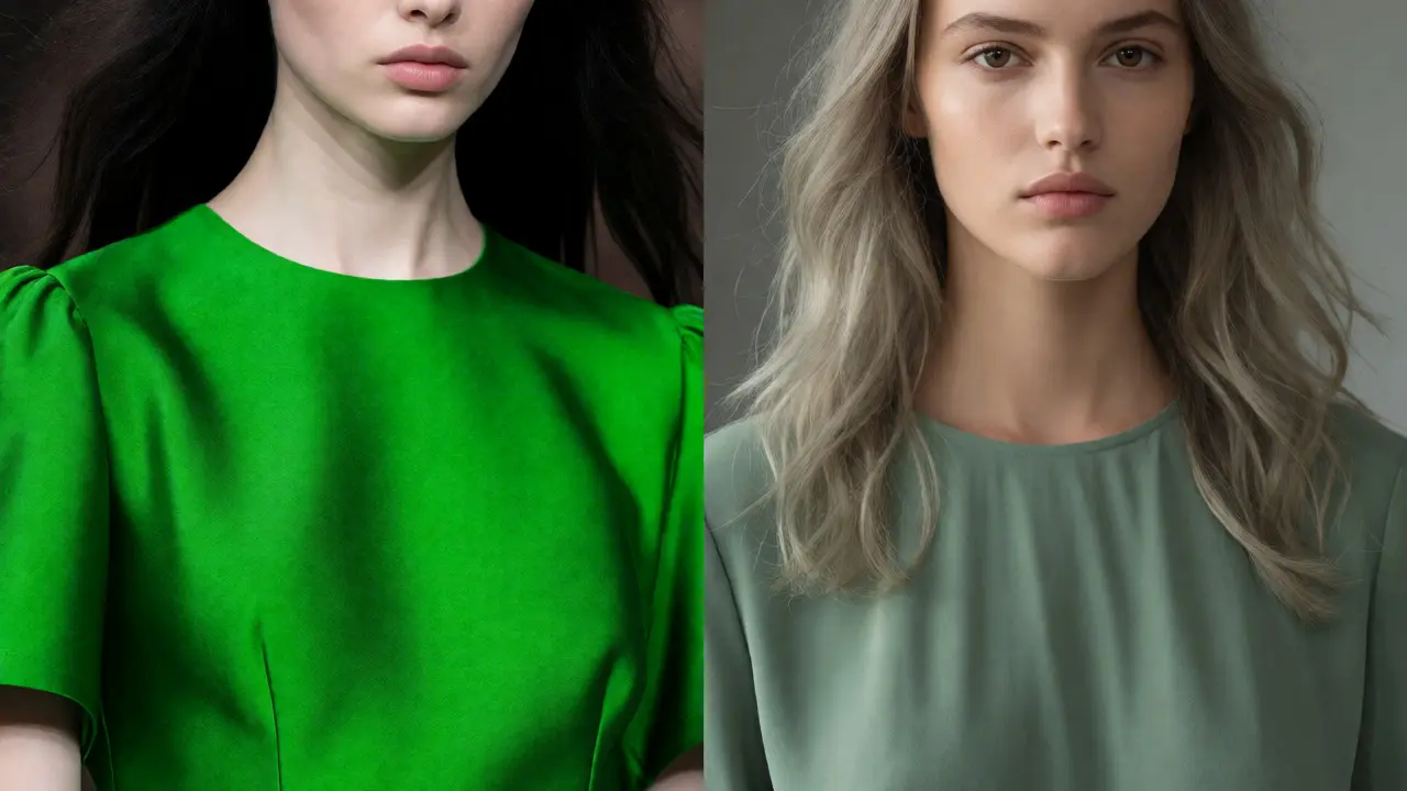
If hue is the name, Saturation refers to the purity of the color, ranging from dull gray to vivid bright. Imagine a bright neon green highlighter. That’s high saturation. Now imagine a sage green plant leaf. That’s low saturation. Both are green (same hue), but they feel completely different.
Your natural coloring has a saturation level too. Do you have high-contrast features? Like dark black hair against pale white skin? You can handle high-saturation colors. Bright jewel tones will pop against you. On the flip side, if you have soft, blended features-like ash blonde hair with hazel eyes-you need muted, dusty colors. Putting a neon orange on someone with soft, low-contrast coloring overwhelms their face. The color becomes louder than the person.
This is why "brights" don’t work for everyone. It’s not that brights are ugly. It’s that they require a canvas that can compete with them. If you have medium contrast, stick to mid-range saturation. Soft pastels and earthy tones will harmonize with your natural palette. When saturation matches your natural intensity, your features come forward. When it doesn’t, the clothes wear you.
Value: Lightness and Darkness
Value describes how light or dark a color is, independent of its hue. Black is the lowest value. White is the highest value. Gray sits in the middle. Every color has a value. Yellow is naturally high-value (light). Navy is naturally low-value (dark).
Why does this matter for your face? Because your face has a value range too. If you have very fair skin and platinum blonde hair, you are high-value. Wearing jet black (low value) creates extreme contrast. For some, that’s striking. For many, it’s harsh. It can create shadows under the eyes and emphasize fine lines. Conversely, if you have deep brown skin and black hair, wearing pure white can sometimes be blindingly stark, though it can also look crisp and clean depending on the cut.
The secret is matching the value of your clothing to the value of your natural coloring. If you are medium-valued (medium skin tone, medium hair), avoid extremes. Pure white might make you look washed out. Pure black might make you look heavy. Instead, opt for charcoal, navy, cream, or taupe. These colors sit comfortably within your natural value range, creating a seamless, polished look.
| Attribute | Definition | Fashion Application | Pitfall to Avoid |
|---|---|---|---|
| Hue | The basic color family (Red, Blue, etc.) | Determine warm vs. cool undertones. | Wearing opposite temperatures (e.g., cool pinks on warm skin). |
| Saturation | Intensity or purity of the color. | Match to natural contrast levels (high contrast = brights). | Overwhelming soft features with neon colors. |
| Value | Lightness or darkness of the color. | Maintain harmony with skin/hair depth. | Using extreme blacks/whites if you have medium contrast. |
Putting It All Together: The Seasonal Shortcut
You’ve probably heard of seasonal color analysis (Spring, Summer, Autumn, Winter). Think of these as pre-packaged bundles of H, S, and V. It’s a helpful starting point, but don’t treat it like a prison sentence.
- Winter: Cool hue, High saturation, High contrast value. Needs bold, clear colors. No muddy tones.
- Summer: Cool hue, Low saturation, Medium/Low contrast. Needs soft, dusty, powdery colors. No harsh neons.
- Autumn: Warm hue, Low/Medium saturation, Medium value. Needs rich, earthy, spicy colors. No icy pastels.
- Spring: Warm hue, High saturation, Light value. Needs fresh, clear, bright colors. No heavy blacks.
If you identify as a "Soft Autumn," for example, you know you need warm hues (hue), muted intensity (saturation), and medium depth (value). Olive green fits all three criteria perfectly. A bright lime green fails the saturation test. A dark forest green might fail the value test if it’s too heavy. Understanding the mechanics helps you debug why a specific garment failed, rather than just blaming the season label.
Practical Steps to Upgrade Your Wardrobe
Don’t throw everything away today. Start with the "Face Zone." This includes tops, scarves, earrings, and necklaces. These are closest to your skin, so they have the biggest impact on how you look.
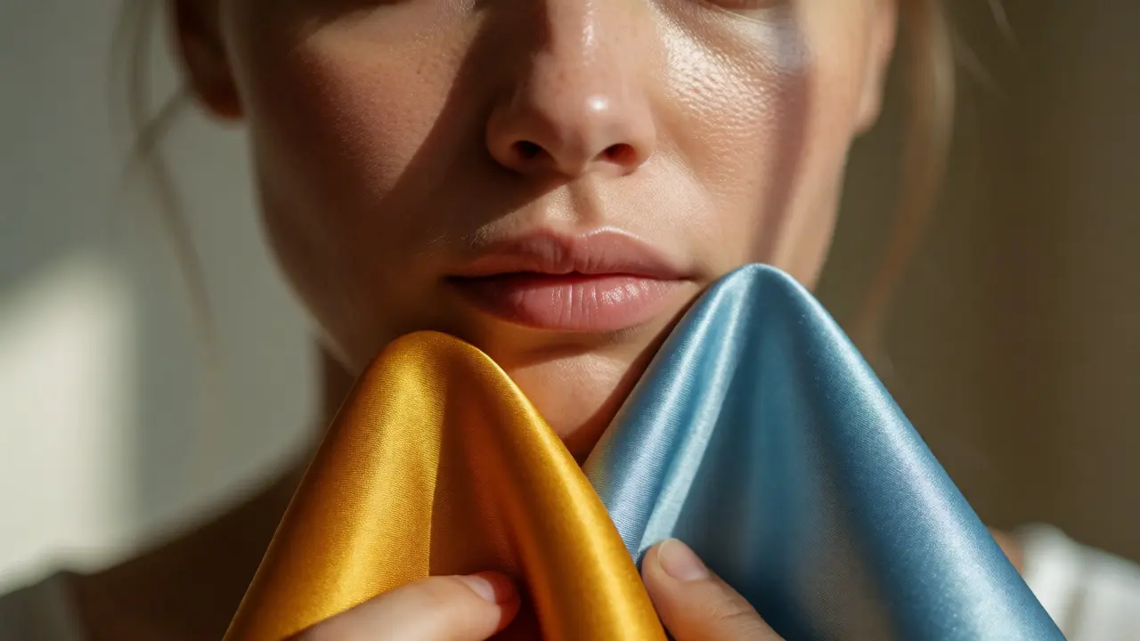
- The Draping Test: Go home with 3-4 tops in different colors. Stand in front of a window with natural light. Hold each one up to your chin. Look at your eyes and mouth. Does the color make your eyes brighter? Or does it cast shadows? Take photos. We see ourselves differently in mirrors due to lighting bias.
- Check the Undertone: If a color makes you look sallow (yellow-green), it’s likely too cool for you. If it makes you look ruddy or flushed, it’s likely too warm. If it makes you look vibrant, keep it.
- Experiment with Neutrals: Not all neutrals are created equal. Black is a cool, high-contrast neutral. Beige is a warm, low-contrast neutral. Charcoal is a cool, medium-contrast neutral. Choose the neutral that matches your HSV profile.
- Add Pop with Accessories: If you love a color that doesn’t suit your face, move it away from your face. Wear it on your legs (pants/skirts) or use it in bags and shoes. This lets you enjoy the hue without the facial penalty.
Common Myths About Color in Fashion
There is a lot of misinformation out there. Let’s clear the air.
Myth 1: "Black is slimming for everyone." False. Black is a high-contrast, low-value color. If you have low contrast (soft features), black can actually draw attention to body contours and wrinkles because it creates a hard silhouette against your skin. Navy or dark charcoal often provides the same slimming effect with less harshness.
Myth 2: "Pastels are only for Spring." False. Pastels are high-value and low-saturation. While Springs love them, Summers also wear pastels beautifully because they share the low-saturation requirement. The difference is temperature. Summers need cool pastels (lavender, baby blue). Springs need warm pastels (peach, mint). Same value, different hue.
Myth 3: "If I’m not a 'Winter,' I can never wear black." Again, false. You can wear black if you break it up. Use a scarf in your best color near your face. Wear open-neck tops. Layer it. Black is a texture and a shape tool, not just a color. Just be mindful of how close it sits to your jawline.
Troubleshooting Your Current Closet
Look at the clothes you own but never wear. Why are they sitting there? Run them through the HSV checklist.
Is that neon yellow dress gathering dust? Maybe it’s too saturated for your soft coloring. Can you fix it? Probably not easily. Donate it. Is that beige blazer making you look invisible? Maybe it’s too low-value for your high-contrast features. Try adding a statement necklace in a high-contrast color to bridge the gap. If the garment fights your natural HSV profile, no amount of accessorizing will fully save it. Sometimes, letting go is the best style choice.
Remember, color is subjective emotionally, but objective physically. Your skin reflects light based on its pigment. Certain wavelengths bounce back better than others. When you align your clothes with those wavelengths, you aren’t just "looking pretty." You’re optimizing how light hits your face. And that makes you look healthier, more awake, and more confident.
What is the difference between hue, saturation, and value?
Hue is the actual color name (like red or blue). Saturation is the intensity or purity of that color (vivid vs. dull). Value is how light or dark the color is (white vs. black). All three must be considered together to determine if a color suits your personal complexion.
How do I find my undertone?
Check your veins in natural light. Green veins suggest warm undertones. Blue or purple veins suggest cool undertones. If you can't distinguish, you are likely neutral. Another test is jewelry: gold usually flatters warm tones, while silver flatters cool tones.
Can I wear colors outside my seasonal palette?
Yes. Seasonal palettes are guidelines, not laws. If you love a color that doesn't suit your face, wear it lower on your body (pants, skirts) or as an accessory. Alternatively, adjust the saturation or value of that hue to better match your contrast level.
Why does black make me look tired?
Black is a low-value, high-contrast color. If you have soft, low-contrast features, black creates a harsh boundary against your skin, emphasizing shadows under the eyes and fine lines. Try dark navy, charcoal, or espresso brown instead for a softer, yet still slimming, effect.
Do I need to change my makeup to match my clothes?
Ideally, yes. Your makeup should harmonize with your clothing's temperature. If you wear cool-toned clothes, use cool-toned lipstick and blush. If you wear warm-toned clothes, switch to peach or coral shades. Mismatched temperatures can make both the clothes and the makeup look off.