

You know that feeling when you walk into a store and everything just looks different? Not necessarily better or worse, but shifted. The stark whites are gone, replaced by warm creams. The neon pops have cooled down to dusty terracottas. That shift isn't random. It’s the result of millions of data points, cultural moods, and designer intuitions colliding to create what we call color trends. For anyone building a wardrobe in late 2024 through 2026, understanding these shifts saves money and prevents that "why does this look weird on me?" panic.
We’re currently standing at the intersection of two major fashion cycles. The immediate future-Spring/Summer 2025 and Fall/Winter 2025-is already locked in with specific dominant hues. But looking ahead to 2026, the palette is evolving again, moving away from the maximalist chaos of the early 2020s toward something more grounded yet expressive. If you want your closet to feel current without buying new clothes every six months, you need to know which colors are rising and which are fading.
The Psychology Behind the Palette Shift
Why do colors change? It’s not just designers picking their favorites. Fashion reflects the collective mood. When global uncertainty is high, people tend to gravitate toward comfort colors-soft blues, gentle greens, and warm neutrals. When confidence returns, bold reds and electric yellows surge back in. Right now, we are seeing a fascinating blend. We are tired of the digital screen fatigue (hello, cool grays), so we crave warmth. But we also want individuality, so we aren’t returning to the beige minimalism of 2018-2020.
This duality defines the 2025 color story. It’s about "grounded vibrancy." You’ll see earth tones that pop rather than recede. Think burnt orange instead of muted rust, or teal instead of navy. This trend responds to a desire for optimism without losing touch with reality. Designers like those at Pantone, the authority on color standards, have noted a significant uptick in requests for colors that bridge natural elements with synthetic energy.
Dominant Hues for Spring/Summer 2025
If you are shopping right now for next season, keep your eyes peeled for these four key players. These aren't just suggestions; they were the most repeated colors across New York, London, Milan, and Paris runways last September.
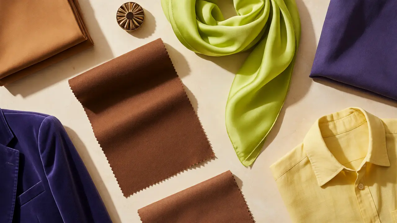
- Mocha Mousse: A rich, creamy brown that replaces the stark white of previous years. It’s versatile, flattering on almost all skin tones, and pairs beautifully with denim.
- Cyber Lime: Yes, it’s still here, but it’s softer. Less acid green, more chartreuse. Use it as an accent-a bag, a pair of socks, or a belt-to break up neutral outfits.
- Future Dusk: A deep, moody purple-blue. It acts as a new black. It’s sophisticated and slightly mysterious, perfect for evening wear or professional blazers.
- Sunlight: A pale, buttery yellow. Unlike the bright lemon yellows of summer past, this is subtle. It adds warmth to winter wardrobes and feels fresh in spring.
Don’t ignore the power of mixing these. A Mocha Mousse trench coat over a Cyber Lime tee creates a high-fashion contrast that feels effortless. The key is balance. One loud color, one grounding neutral.
Fall/Winter 2025: Going Deep and Dark
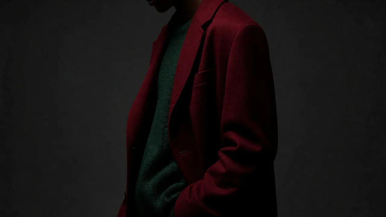
As the temperature drops, the palette deepens. The lightness of spring gives way to intensity. This is where jewel tones make their comeback, but with a twist. They are less saturated, more matte. Think velvet textures rather than shiny satin.
| Primary Hue | Best Partner Color | Vibe |
|---|---|---|
| Burgundy Red | Charcoal Gray | Classic Sophistication |
| Forest Green | Cream White | Natural Calm |
| Royal Blue | Mustard Yellow | Bold Confidence |
| Taupe | Black | Modern Minimalism |
Burgundy Red is arguably the star of the cold months. It’s romantic, powerful, and far more interesting than standard black. Pair it with gray to tone it down for office settings, or go head-to-toe in red for a statement look. Forest Green offers a similar depth but feels more organic. It works exceptionally well with leather accessories and wool coats.
Looking Ahead: What Changes in 2026?
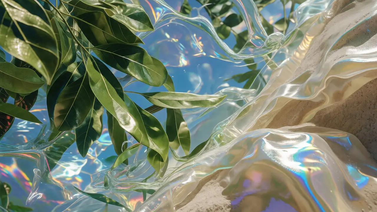
Predicting 2026 is trickier because we are only seeing early indicators from textile fairs and emerging designer collections. However, the trajectory is clear: we are moving toward "Digital Naturalism." This means colors that exist in nature but have been filtered through a digital lens. Imagine a leaf green, but with a slight metallic sheen. Or a sky blue that looks like it was rendered on a screen.
Expect to see more iridescent finishes. While not a color per se, the way light hits fabric will change how we perceive hue. Pearlescent whites and holographic silvers will become staples, replacing flat matte fabrics. This aligns with the growing influence of AI-generated art in design studios. Designers are pulling inspiration from algorithms, resulting in color combinations that human intuition might miss.
Another major shift for 2026 is the rise of "Unbleached Neutrals." Instead of pure white, think oatmeal, sand, and unrefined cotton shades. This ties into the sustainability movement. Bleaching fabrics requires harsh chemicals. By embracing the natural color of raw materials, brands reduce their environmental footprint while offering a warmer aesthetic. If you love minimalist style, start investing in high-quality linen and organic cotton pieces in these earthy tones now. They will be the foundation of 2026’s quiet luxury look.
How to Build a Capsule Wardrobe Around These Colors
You don’t need to buy a new outfit for every trend. Smart shoppers build around versatility. Here is a simple strategy to integrate 2025 and 2026 hues into your existing closet.
- Audit Your Basics: Check your blacks, navys, and grays. If you have too many, consider swapping them for Mocha Mousse or Taupe versions. These neutrals are easier to mix with the coming jewel tones.
- Add One Statement Piece: Pick one trending color that scares you a little. Maybe it’s Cyber Lime or Burgundy Red. Buy it in a small format first-a scarf, a handbag, or shoes. Test it against your skin tone before committing to a full dress or coat.
- Focus on Texture: As mentioned, 2026 is about finish. Mix matte knits with shiny silks. Pair rough tweeds with smooth leathers. The interplay of texture makes even simple color combos look expensive.
- Ignore Fast Fashion Churn: Many fast-fashion brands release micro-trends that last three weeks. Stick to the core palettes outlined above. They have staying power because they address broader cultural needs, not just Instagram aesthetics.
Remember, personal preference trumps trends. If you hate purple, you don’t have to wear Future Dusk. Wear the version of the trend that works for you. Maybe you skip the color entirely but adopt the silhouette or texture associated with it.
Common Mistakes When Adopting New Color Trends
Even with good intentions, people often mess up color adoption. The biggest error is going all-in too quickly. Buying five items in the same trending shade can lead to regret if the color doesn’t photograph well or clashes with your complexion. Always test colors in natural light. Store lighting is notoriously deceptive, often washing out warm tones or making cool tones look sterile.
Another pitfall is ignoring undertones. A warm red looks different on someone with cool undertones than it does on someone with warm ones. Use the draping method: hold the fabric near your face in daylight. Does your skin look radiant or sallow? Radiant means it’s a match. Sallow means you need to adjust the shade or separate it from your face with a neutral layer.
Finally, don’t forget accessories. Shoes, bags, and jewelry are low-risk ways to participate in trends. A silver bag fits the 2026 iridescent theme perfectly without requiring a full outfit overhaul. It’s a smart entry point for skeptics.
The Role of Sustainability in Color Choice
It’s impossible to talk about 2025 and 2026 colors without mentioning sustainability. Dyeing processes are among the most polluting aspects of fashion production. Water-intensive dyes and toxic mordants are under scrutiny. This has led to a rise in plant-based dyes and digital printing techniques.
Plant-based dyes often produce softer, more muted colors. This explains the prevalence of earth tones and pastels in recent collections. They aren’t just aesthetic choices; they are technical limitations turned into stylistic strengths. Brands like Stella McCartney and Eileen Fisher have pioneered these methods, influencing mainstream retailers to follow suit.
When you shop, check the care labels. Look for certifications like GOTS (Global Organic Textile Standard) or OEKO-TEX. These indicate safer dye processes. Supporting brands that prioritize sustainable coloring helps drive the industry forward. Plus, these garments often age better, maintaining their integrity longer than chemically treated alternatives.
What is the hottest color for 2025?
While there is no single "hottest" color, Mocha Mousse (a rich brown) and Cyber Lime (a soft chartreuse) are leading the pack for Spring/Summer 2025. For Fall/Winter, Burgundy Red and Forest Green dominate. These colors reflect a shift toward grounded, earthy vibrancy rather than stark minimalism or neon excess.
Are neutrals still in style for 2026?
Yes, but they are changing. Pure white and stark black are giving way to "Unbleached Neutrals" like oatmeal, sand, and taupe. These warmer, organic shades align with sustainability efforts and provide a softer backdrop for the bolder accent colors expected in 2026.
How do I choose a color that suits my skin tone?
Use the draping method: hold the garment near your face in natural daylight. If your skin looks healthy and radiant, the color works. If it looks sallow or tired, try a different shade. Generally, warm undertones suit earthy oranges, yellows, and olives, while cool undertones favor blues, purples, and emerald greens.
Will pastel colors return in 2026?
Pastels are evolving rather than disappearing. Expect "digital pastels"-colors that look like they have a slight metallic or iridescent finish. Soft pinks and baby blues will remain relevant but may appear more saturated or glossy compared to the matte pastels of previous years.
Do I need to throw out my old clothes to follow these trends?
No. Trends are guides, not rules. You can update your look by adding one accessory in a trending color or swapping a basic neutral piece for a warmer alternative. Focus on integrating new hues gradually rather than replacing your entire wardrobe.