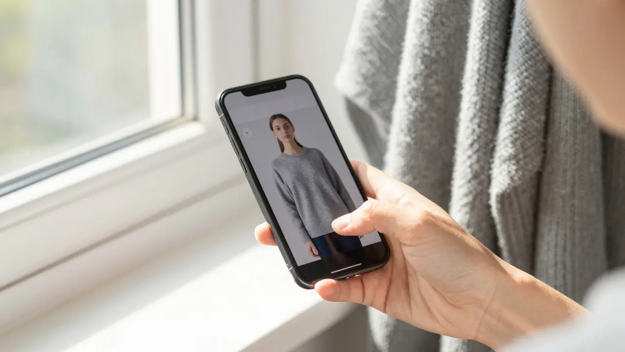
Ever ordered a dress online only to find out the color looks nothing like it did on your screen? You picked it because it looked like a soft rose pink in the photo, but when it arrived, it was more like muddy coral. This isn’t a glitch in the system-it’s a common problem caused by screen color accuracy and lighting conditions. And if you’re shopping for clothes online, getting this wrong can mean returns, wasted time, and frustration.
Why Your Screen Lies About Color
Not all screens show color the same way. A laptop bought in 2023, a phone from 2025, and a tablet from 2021 each have different panels, brightness settings, and color profiles. Even two identical phones can display the same image differently if one has night mode on and the other is in bright sunlight. Manufacturers tune screens for punchy, saturated colors because that’s what sells-brighter reds, deeper blues. But that’s not how clothes look in real life.Most online retailers use stock photos taken under studio lighting, which is balanced and neutral. But when you view those photos on your phone with a warm tint, or your monitor set to “vivid” mode, the color shifts. A navy blue might look black. A cream might look yellow. And suddenly, your whole outfit looks off.
How Lighting Changes Everything
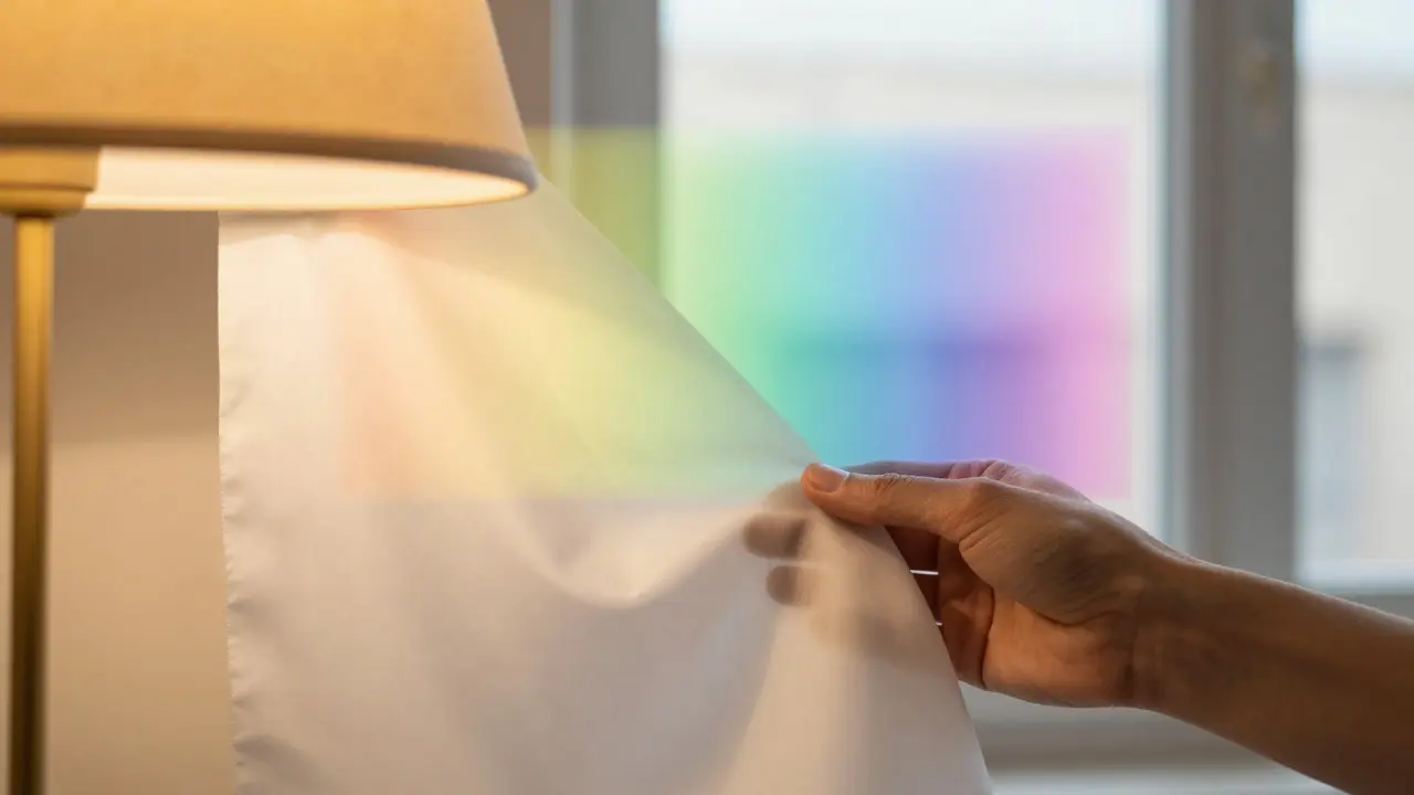
Lighting is just as important as your screen. Natural daylight is the gold standard for color accuracy-it shows true tones without bias. But most people view clothes under indoor lighting: LED, incandescent, or fluorescent. Each one warps color differently.- Incandescent bulbs (old-style warm bulbs) add a yellow-orange cast. Whites look creamy. Blues look dull.
- Fluorescent lights often give a greenish or cold blue tint. Pastels look washed out.
- LED lights vary wildly. Some are cool and clinical, others are warm and cozy. Many cheap LEDs have poor color rendering (CRI below 80), which means colors don’t appear true.
Try this: hold up a white shirt under your bedroom lamp and then near a window. See the difference? That’s what happens when you shop online. You’re judging color under one light, but wearing it under another.
How to Fix It: Real-World Fixes
You can’t control how retailers photograph clothes. But you can control how you view them. Here’s how to get better results:- Turn off night mode and dark themes. These shift the entire color balance. View product pages in daylight mode.
- Set your screen to sRGB or standard color mode. On iPhones, go to Settings > Display & Brightness > Color Profile > sRGB. On Android, look for “Color mode” in display settings and choose “Standard” or “Natural.” Avoid “Vivid” or “Dynamic.”
- View images in natural light. Don’t check colors on your phone while lying in bed under a lamp. Go to a window. Hold your device so the light hits the screen from the side, not directly behind you. This reduces glare and gives a truer sense of hue.
- Compare with a known color. Look at the product photo next to a white piece of paper, a gray card, or even your own skin tone. If the fabric looks like it’s bleeding into your hand, it’s likely too warm or too cool.
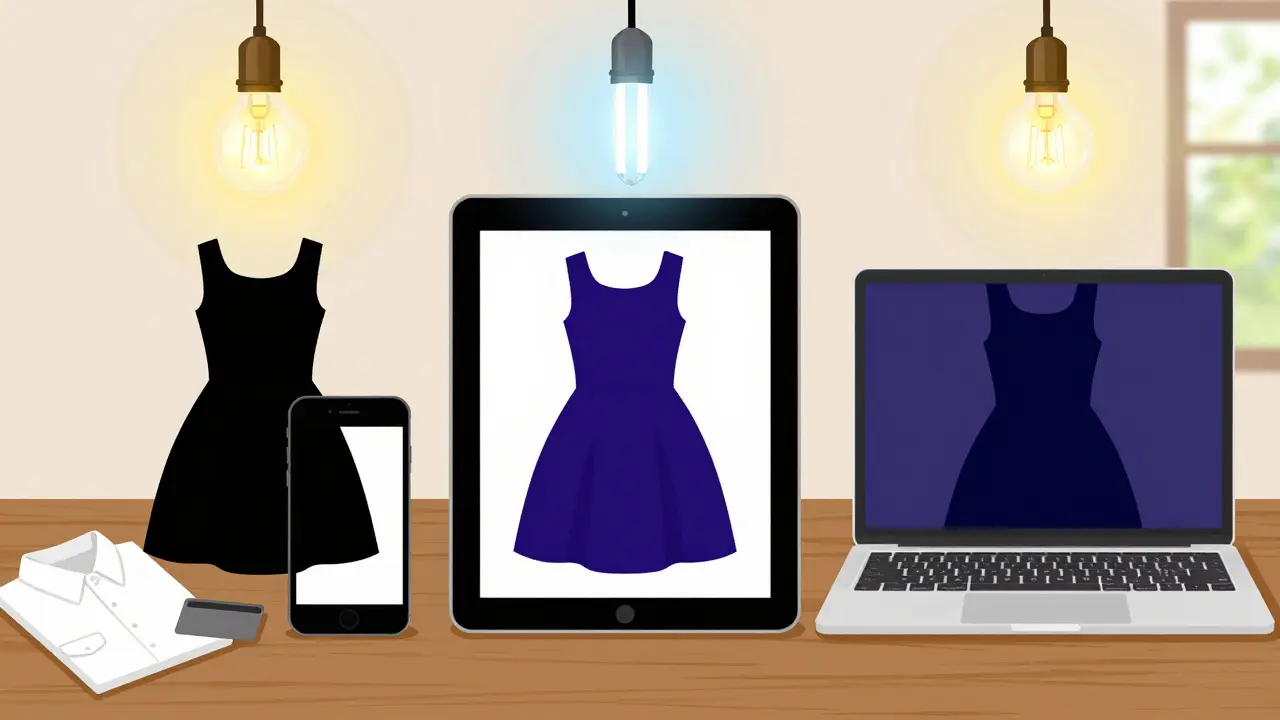
- Check multiple devices. Look at the same item on your phone, tablet, and laptop. If all three show different shades, the image is probably poorly calibrated. Trust the one that looks most like what you’ve seen in real life before.
Use Color References You Already Own
You don’t need a professional color chart. You have one already: your own clothes. Before buying something new, ask yourself: What colors do I already own that I love? Take a photo of a sweater or scarf you wear all the time and compare it to the online product. If the new item looks similar in tone under the same lighting, you’re likely safe.For example, if you’ve got a charcoal gray coat that looks perfect in your hallway light, use it as a reference. If the new blouse looks like it matches that coat’s tone, it’ll probably work. This trick works better than any app or tool because it’s based on your personal experience, not generic standards.
What About Color Analysis Tools?
There are apps and websites that promise to analyze your skin tone and recommend “your colors.” Some are useful. Others are marketing gimmicks. The truth? Most people don’t need a professional color analysis to shop well. You already know what flatters you-you’ve worn it for years.Tools that claim to match your skin tone to fabric color often rely on flawed lighting or camera calibration. A 2024 study from the Society of Imaging Science and Technology found that 78% of smartphone-based color analysis apps misidentified basic skin undertones by more than one category (cool, warm, neutral) when tested under typical home lighting.
Instead of relying on AI, trust your eyes. If you’ve always looked great in olive green but avoid it online because it looks too yellow on screen, that’s your cue. It’s not that the color doesn’t suit you-it’s that your screen is lying.
What to Do When You’re Not Sure
If you’re torn between two shades, here’s a simple rule: go one shade lighter than you think. Most screens darken colors. A deep burgundy might look like black. A dusty lavender might look gray. If the image looks rich, assume it’s darker in real life. Choose the lighter option.Also, read reviews. Look for comments like “color is more muted than pictured” or “looks different in natural light.” These aren’t complaints-they’re clues. If three people mention the same issue, it’s not a fluke.
Final Tip: Order Multiple Sizes or Colors
Some retailers let you order two colors of the same item with free returns. Use that. Buy the one you think you want, and the one you’re unsure about. Try them both on in natural light. Wear them around your house for an hour. See how they look with your skin, your jewelry, your existing clothes. Then return the one that doesn’t work.This costs a little more upfront, but it saves you from the hassle of returns, waiting for replacements, and ending up with something you never wear. It’s the smartest way to shop online for color-sensitive items like tops, scarves, and dresses.
It’s Not About Perfection-It’s About Consistency
You don’t need your screen to be perfectly calibrated. You just need it to be consistent. If you always view clothing under the same lighting, with the same device settings, you’ll start to learn how your screen translates real colors. Over time, you’ll develop a mental correction. That navy blue that looks black on your phone? You’ll know it’s actually navy. That cream that looks yellow? You’ll know it’s ivory.That’s the real skill: learning how your environment distorts color, and adjusting for it. You don’t need expensive tools. You just need to pay attention.
Why do clothes look different online than in real life?
Clothes look different online because of two main factors: screen calibration and lighting. Most screens are tuned to show brighter, more saturated colors to grab attention, while online photos are taken under neutral studio lighting. When you view those images on a warm-toned phone or under dim indoor lighting, the colors shift. A soft beige might appear yellow, and a deep purple might look black. Your eyes adapt to your screen’s settings, so what looks right on your device may not match reality.
Is there a best color mode for shopping online?
Yes. Set your device to sRGB or Standard color mode. Avoid Vivid, Dynamic, or Boost modes-they exaggerate contrast and saturation. On iPhones, go to Settings > Display & Brightness > Color Profile and select sRGB. On Android, find Display > Color Mode and choose Natural or Standard. This gives you the most accurate representation of how the color will appear in natural light.
Can I trust color analysis apps that recommend my perfect colors?
Most color analysis apps are unreliable under typical home lighting. A 2024 study found that 78% of smartphone-based tools misidentified basic skin undertones by more than one category (cool, warm, neutral). These apps often assume perfect lighting and camera quality, which most users don’t have. Instead of relying on AI, use your own wardrobe as a guide. What colors do you already own and feel great in? Those are your true colors.
How can I check if an online color will suit me before buying?
Hold your phone or tablet near a window and view the product image in natural daylight. Compare it to a garment you already own and love. If the new item looks similar in tone under the same lighting, it’s likely a good match. Also, read customer reviews for mentions like “color is more muted” or “looks different in sunlight.” These are reliable indicators.
Should I order multiple colors to find the right one?
If the retailer allows free returns and you’re unsure between two shades, yes-order both. Try them on in natural light, wear them around your home for an hour, and see how they look with your skin tone and existing clothes. Return the one that doesn’t work. This prevents the frustration of a wrong purchase and ensures you end up with something you’ll actually wear.


Write a comment