

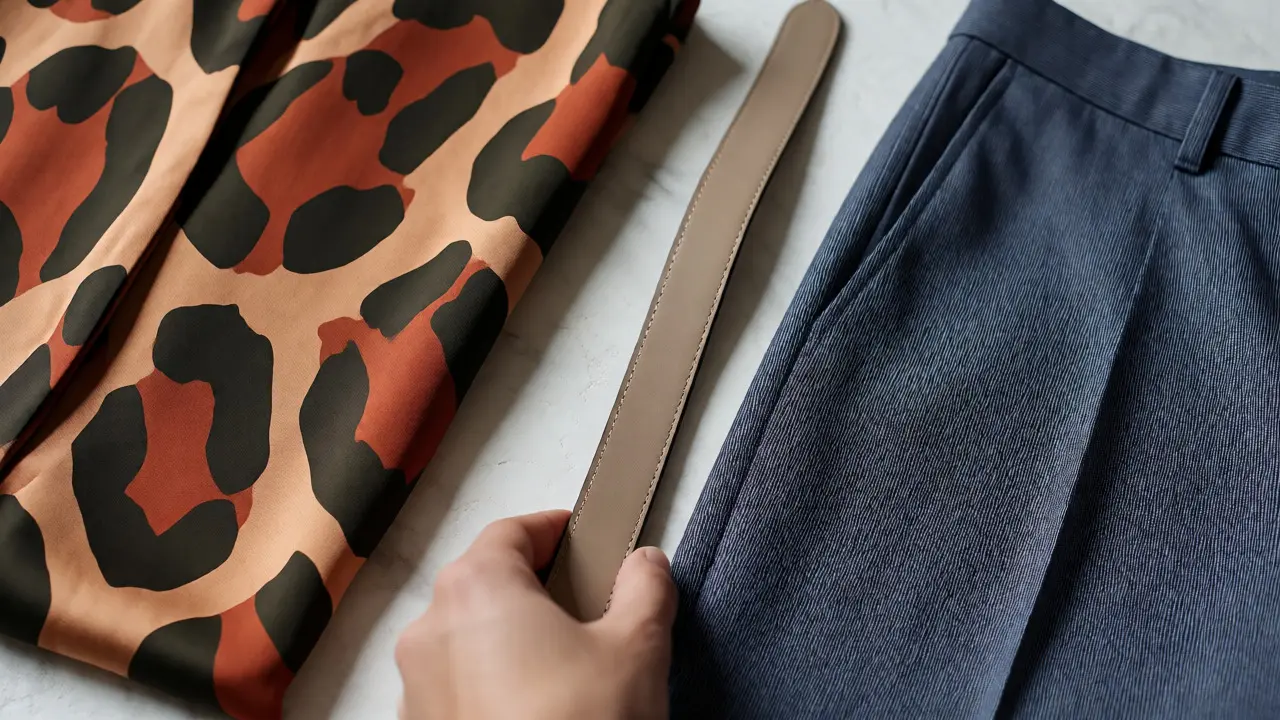
You look in the mirror and think your outfit is a mess. The stripes are fighting the florals. The polka dots are screaming at the plaid. You feel like you’re wearing three different outfits at once instead of one cohesive look. This isn’t bad luck; it’s a lack of understanding how visual weight works. Print mixing is a skill, not an accident. It relies on two invisible rules: scale differentiation and undertone harmony. Once you see these mechanics, you stop guessing and start curating.
The Myth of "Anything Goes"
Let’s kill this idea right now. Just because trends say "clash," doesn't mean chaos is chic. If you throw random prints together, you don’t look edgy; you look confused. The secret lies in contrast. Your eye needs a place to rest. If every part of your outfit has the same level of detail, your brain gets overloaded. Think of your outfit as a room. You wouldn’t put bold wallpaper on all four walls, a busy rug, and loud curtains. You need negative space. In clothing, that space comes from varying the size of your patterns.
Mastering Scale: The Big and Small Rule
Scale is the size of the motif in a print. This is the number one reason print mixing fails for most people. They pair a small floral blouse with a small striped skirt. Both compete for attention. Neither wins. The result is visual noise.
Pattern scale must be distinct. Aim for a significant difference between the two prints. If you wear a large-scale geometric print, pair it with a micro-print or a solid color. If you choose a delicate paisley shirt, balance it with wide-leg trousers featuring a bold, oversized check. A good rule of thumb? Keep the scales at least three times different in size.
- Large + Small: Big leopard spots work with tiny pinstripes.
- Medium + Solid: Medium-sized houndstooth pairs best with a plain neutral base.
- Avoid Same-Scale: Never mix two medium-sized prints unless they share identical colors and very similar spacing.
This hierarchy guides the viewer’s eye. They look at the big pattern first, then notice the small one as a texture. That flow makes the outfit feel intentional rather than accidental.
Undertones: The Color Glue
You’ve got the scale right. Now, why does it still feel off? Check your undertones. Prints aren’t just shapes; they are carriers of color temperature. Some reds lean orange (warm). Others lean blue (cool). Mixing a warm-toned rust stripe with a cool-toned navy floral creates friction. It feels disjointed because the colors don’t naturally belong together in nature or art history.
Color undertone is the subtle hue bias within a color. To mix prints successfully, ensure both patterns share the same temperature family. Warm prints go with warm prints. Cool prints go with cool prints. Or, use a neutral bridge. Black, white, gray, and denim often act as universal translators. They have no strong undertone, so they can connect a warm print to a cool one without causing conflict.
| Print Type | Best Partner Undertone | Risky Combination |
|---|---|---|
| Warm Earth Tones (Rust, Olive) | Warm Neutrals (Camel, Cream) | Cool Blues or Grays |
| Cool Jewel Tones (Emerald, Sapphire) | Cool Neutrals (Navy, Charcoal) | Oranges or Yellows |
| Monochrome (Black/White) | Any Temperature | None (Universal) |
When in doubt, pull one color from each print and see if they match. If the green in your floral shirt matches the green background of your striped scarf, you have found your anchor. That shared color ties the disparate patterns into a single narrative.
Complementary Patterns: Geometry vs. Organic
Not all prints are created equal. Some are rigid; others are fluid. Geometric patterns include stripes, checks, grids, and chevrons. They are structured and predictable. Organic patterns include florals, abstracts, animal prints, and paisleys. They are irregular and flowing.
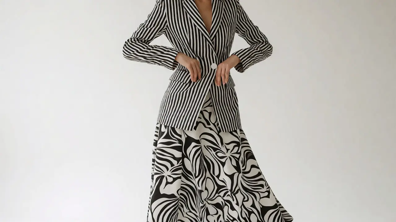
The most harmonious mixes usually pair one geometric print with one organic print. Why? Because they offer contrasting rhythms. The straight lines of a stripe provide structure for the chaotic curves of a floral. It’s like pairing a drum beat with a melody. One keeps time; the other sings.
Try these proven combinations:
- Stripes + Florals: The classic safe bet. Vertical stripes elongate the body, while florals soften the look.
- Checks + Animal Print: Leopard spots break up the rigidity of plaid. This looks sophisticated, not safari-random.
- Dots + Abstracts: Polka dots add playfulness to serious abstract art prints.
Avoid pairing two highly structured prints, like two different types of plaids, unless you are an expert. Two organic prints, like two different florals, can also clash unless they share a very specific style era.
The Neutral Anchor Strategy
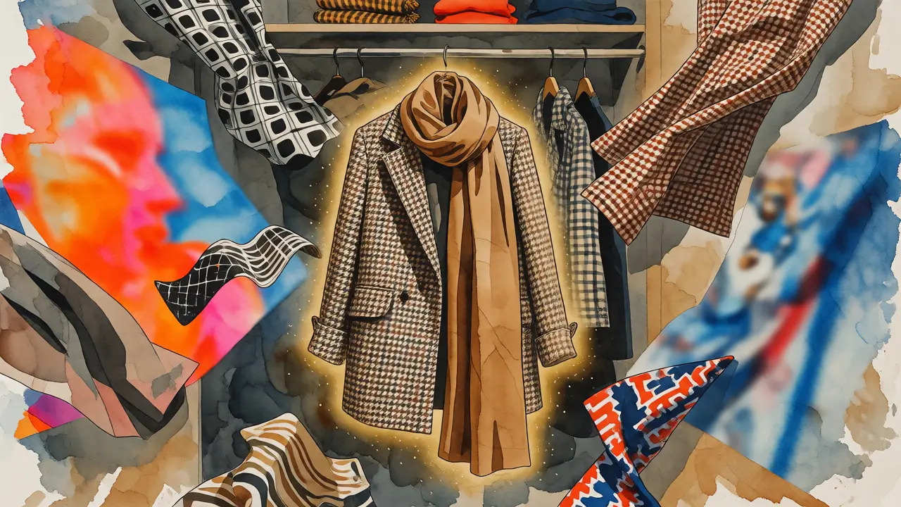
If you’re nervous about going full-on pattern party, start with a neutral anchor. This is the easiest way to ease into print mixing. Wear one bold printed piece and surround it with solids. Then, introduce a second print only through accessories. A printed bag, shoes, or scarf counts as a pattern.
For example, wear a solid navy dress. Add a striped blazer. Now you have one print. Next week, swap the blazer for a floral one. See how the vibe changes? Once you’re comfortable, try wearing the striped blazer over a floral top. But keep the pants solid. This "two prints, one solid" formula is foolproof for beginners.
Denim is your best friend here. Jeans are technically a textured fabric with a slight pattern (the weave), but we treat them as a neutral. A floral blouse under a denim jacket with striped pants? Yes. The denim breaks the tension between the floral and the stripes.
Troubleshooting Common Mistakes
Still feeling unsure? Run through this checklist before you leave the house.
- Is there enough contrast in scale? Step back five feet. Do the prints blend into mush? If yes, change one to a larger or smaller scale.
- Do the colors clash? Take a photo. Look at it in black and white. If the values (lightness/darkness) are too similar, the outfit will look flat. Ensure one print is lighter or darker than the other.
- Are the styles compatible? Does a preppy gingham shirt make sense with a boho tribal print? Usually, no. Stick to prints that share a similar aesthetic mood, even if the patterns differ.
Remember, confidence sells the look. If you hesitate, people notice the hesitation, not the outfit. Own the clash.
Can I mix more than two prints?
Yes, but it requires strict control. Limit yourself to three prints maximum. Use the "Two Prints, One Solid" rule first. For three prints, ensure one is a micro-pattern that reads as a solid from a distance. Also, all three must share at least one common color to tie them together.
Does print mixing work for professional settings?
Absolutely. Choose subtle prints. Pair a fine pinstripe suit with a micro-check shirt. Or wear a solid blazer with a subtly patterned blouse. Avoid loud, large-scale prints like big leopards or neon florals in conservative offices. Stick to tonal prints where the pattern is visible only up close.
What if my prints have no matching colors?
Use a neutral accessory to bridge the gap. A belt, bag, or pair of shoes in black, white, tan, or navy can separate the conflicting colors. Alternatively, choose prints that share the same saturation level (both muted or both bright) even if the hues differ. This creates harmony through intensity rather than color matching.
How do I know if a print is warm or cool?
Look at the dominant color's bias. Reds with orange hints are warm; reds with pink/purple hints are cool. Greens with yellow hints are warm; greens with blue hints are cool. When in doubt, hold the fabric next to a pure white sheet. Warm tones will look slightly yellowish against pure white; cool tones will look slightly bluish.
Are animal prints considered patterns?
Yes, and they function as neutrals when used correctly. Leopard, zebra, and snake prints can be mixed with almost anything if kept in monochromatic colors (black/brown/white). However, colored animal prints (like pink leopard) should be treated as standard colorful prints and matched by undertone.


Write a comment