

You’ve bought the dress. The color is perfect. The fabric feels luxurious. But when you look in the mirror, something feels off. You don’t look like the model on the hanger; you look like you’re wearing a tablecloth or drowning in tiny dots. This isn’t about your weight. It’s about print scale. It is the relationship between the size of a pattern and the surface area of your body. When these two elements clash, your outfit fights against your natural lines instead of enhancing them.
Most people buy patterns based on what they like, not how it interacts with their frame. A large floral print might scream "summer" but can overwhelm a petite frame, making you look shorter and wider. Conversely, a micro-print on a tall, curvy figure can get lost visually, failing to add the necessary definition to your silhouette. Understanding this dynamic changes everything. You stop guessing and start styling with intention. Here is how to match pattern size to your physical reality so your clothes work for you, not against you.
The Core Principle: Contrast and Continuity
Pattern harmony relies on the principle of visual continuity. If a pattern breaks up your body's natural lines too aggressively, it creates visual noise. If it blends too seamlessly, it offers no structure. The goal is balance.
Think of your body as a canvas. A large-scale print has fewer, bigger motifs. These require more space to be understood by the eye. If you cut a large motif at the shoulder or waist, the brain struggles to complete the image, creating visual fragmentation. Small-scale prints have many small motifs. They create texture rather than distinct shapes. On a large body, these can blur together, looking like solid color from a distance, which misses the opportunity to add interest.
The rule of thumb is simple: Match the density of the pattern to the amount of skin or fabric surface available. More surface area needs larger, bolder patterns to remain visible and flattering. Less surface area needs smaller, finer patterns to avoid overwhelming the frame.
Petite Frames: Avoiding the Overwhelm
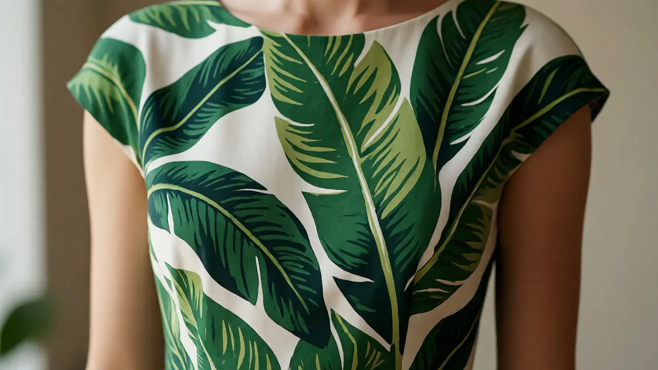
If you are under 5'4" (163 cm), your primary enemy is visual clutter. Large prints dominate your vertical line. Imagine wearing a shirt with huge tropical leaves. Each leaf might be 8 inches wide. If your torso is only 14 inches long, you see less than two full leaves. The rest is chopped off. This truncates your height.
- Go Micro: Look for pin stripes, tiny polka dots, or mini florals. These add texture without breaking your vertical line.
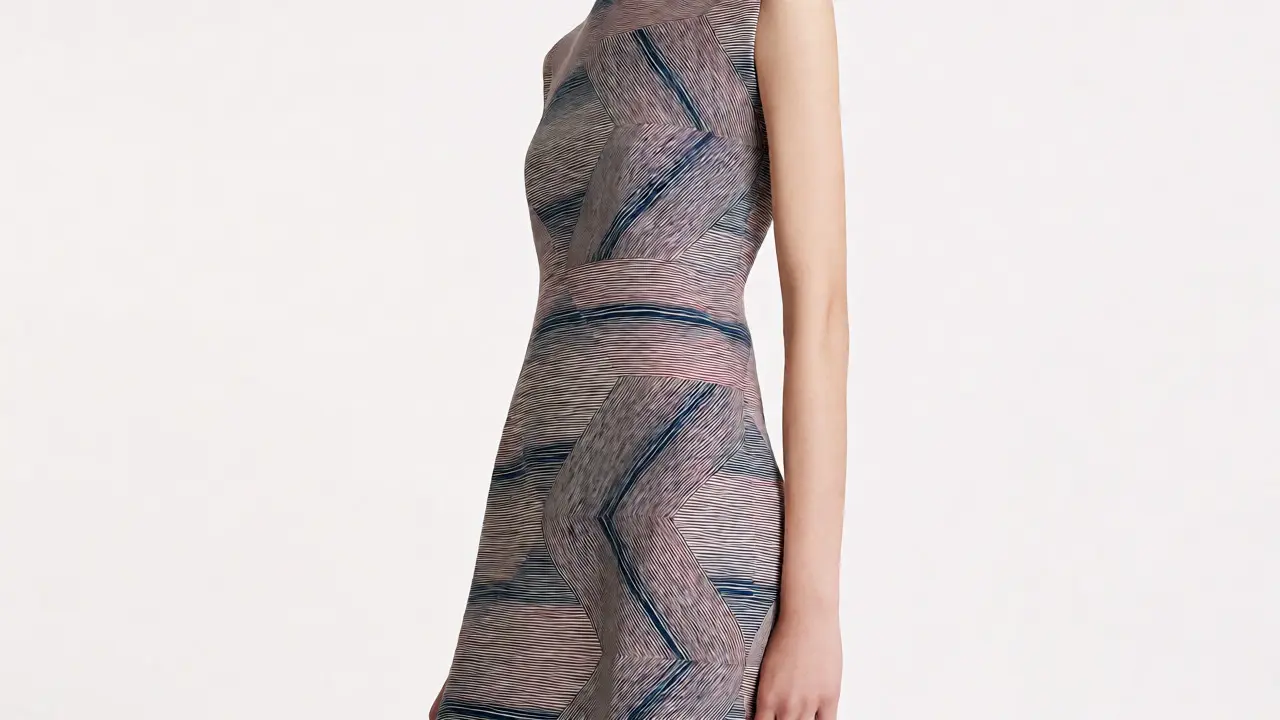
- Diagonal Lines Help: Diagonal stripes or angled geometric prints draw the eye up and down, elongating the frame.
- Watch the Spacing: Even a small print can feel busy if the motifs are packed tightly. Leave some breathing room in the design.
A common mistake is avoiding all prints because you fear looking bulky. Don't. Just keep the motif size under 2-3 inches. If you love florals, choose ones where the flowers are clustered closely together rather than spread out across yards of fabric. This creates a cohesive block of color that doesn't fragment your silhouette.
Tall and Lean: Adding Width and Interest
For those over 5'7" (170 cm) with a straighter build, the challenge is often adding visual width or softening angularity. Very small prints can make you look even taller and thinner, sometimes appearing fragile or overly severe.
Medium to large prints work well here. A bold geometric pattern or a medium-sized floral adds horizontal visual stops that break up the long vertical line. This creates the illusion of curves where there might be none.
| Height Range | Recommended Motif Size | Best Pattern Types | What to Avoid |
|---|---|---|---|
| Under 5'4" | Small (< 2") | Micro-dots, pinstripes, mini-florals | Oversized checks, giant blooms |
| 5'4" - 5'8" | Medium (2" - 5") | Classic florals, paisley, medium checks | Extremely dense micro-prints |
| Over 5'8" | Large (> 5") | Bold geometrics, large abstracts, oversized plaids | Fine, indistinct textures |
Vertical stripes are tricky here. While they elongate, extremely thin vertical stripes on a tall person can emphasize length excessively. Opt for wider stripes or broken vertical lines (like windowpane checks) to add structure without stretching you further.
Curvy Bodies: Balancing Volume and Flow
If you have significant curves-whether you are plus-size or just have an hourglass figure-the wrong print can add bulk. The goal is to follow the body's contours without exaggerating volume.
Medium-to-large prints are generally safest. Why? Because they provide enough visual anchor to respect the scale of your curves. Tiny prints on a curvy body can vibrate optically, creating a shimmering effect that draws attention to every bump and dip. Large, bold prints can sometimes stretch awkwardly around the bust or hips, distorting the pattern.
- Drape Matters: Fabric flow is crucial. A stiff fabric with a large print will stick out. A fluid jersey with the same print will hug and move, keeping the pattern intact.
- Placement is Key: Try to place the largest part of the pattern away from areas you want to minimize. For example, if you want to slim your midsection, avoid placing a massive central medallion directly over the stomach.
- Diagonals Again: Diagonal prints are universally flattering for curvy bodies because they mimic the natural slope of the body, guiding the eye smoothly rather than cutting across it abruptly.
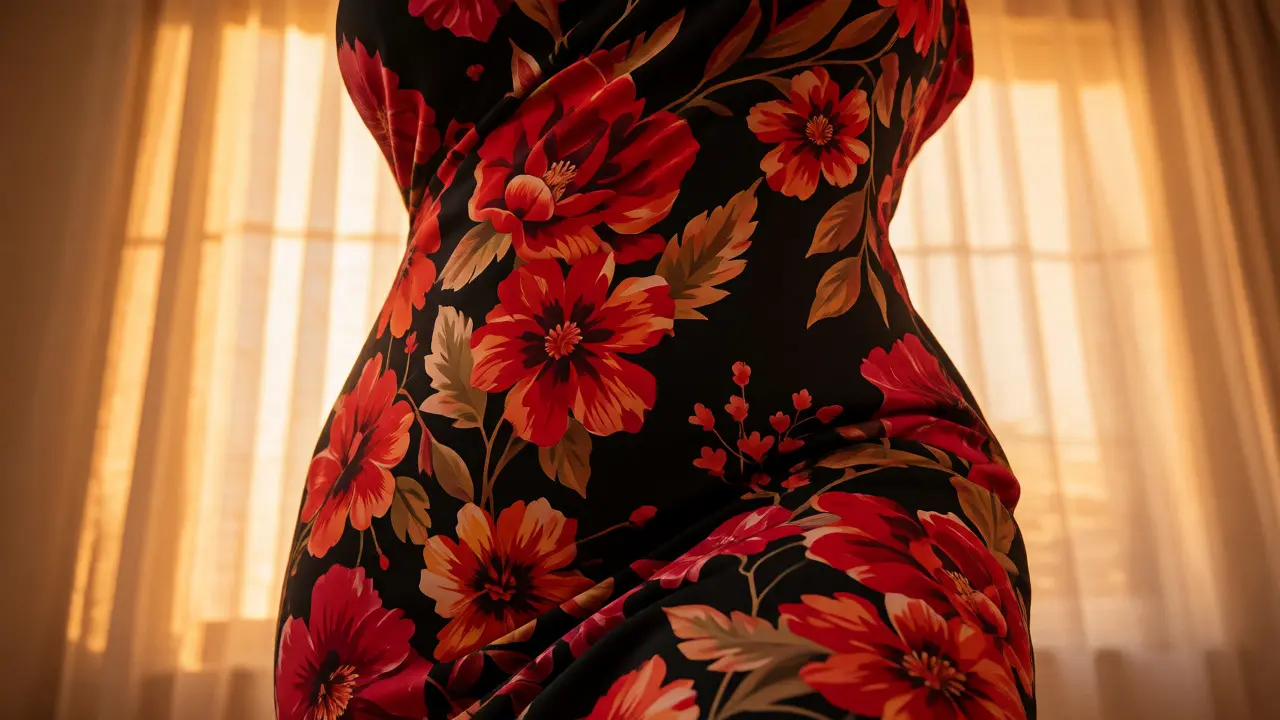
Don't shy away from bold colors. Curves can handle saturation better than straight frames because the volume provides a strong base. A bright red with a black leopard print looks intentional and powerful on a curvy frame, whereas it might look chaotic on a very slender one.
Strategic Placement: Where to Put the Print
Sometimes, you can't find a garment with the perfect overall print scale. That’s okay. Use placement to your advantage. This is called strategic printing.
If you have broad shoulders, wear a top with a smaller print near the neckline and a larger print lower down. This draws the eye downward, balancing the upper body. If you have heavier hips, try a skirt with a subtle print at the hem and a solid top, or vice versa depending on your comfort level.
Consider using accessories to test scales before committing to a whole garment. A scarf with a large print can show you how that scale looks near your face and upper body. A belt with a bold pattern can indicate how much visual weight a specific size adds to your waist.
Common Pitfalls and Quick Fixes
One major error is ignoring the background color. High-contrast patterns (black and white) are more aggressive than low-contrast ones (navy and blue). If you are unsure about a large print, choose a low-contrast version. It will still add interest but won't fight your body shape as hard.
Another issue is mixing scales. Wearing a small-print shirt under a large-print jacket can look messy unless done deliberately. Generally, stick to one dominant scale per outfit. If you mix, ensure the patterns share a common color palette to tie them together.
Finally, remember that fit overrides pattern. A poorly fitting garment with a perfect print will always look worse than a well-fitting garment with an average print. Ensure your seams sit correctly before worrying about the motif size.
FAQ: Print Scale and Body Shape
Does wearing small prints make me look smaller?
Not necessarily. On a large body, tiny prints can blend into a blurry texture, offering no slimming effect. Medium prints that follow the body's curve are often more flattering because they define shape rather than obscuring it.
Can I wear large prints if I am petite?
Yes, but with caution. Choose large prints with negative space (background color) so the motifs aren't touching each other. Also, ensure the garment fits perfectly so the pattern isn't distorted by pulling or gaping.
Do stripes count as a print scale issue?
Absolutely. Thin stripes act like a micro-print, while thick stripes act like a macro-print. Vertical thin stripes elongate, while horizontal thick stripes widen. Adjust stripe width based on whether you want to lengthen or broaden your appearance.
How do I know if a print is too big for my body?
Stand in front of a mirror at arm's length. If you can clearly distinguish individual motifs without squinting, and they don't overlap significantly with your body's key curves (bust, waist, hip), the scale is likely appropriate. If the pattern looks like static noise, it's too small. If it looks like a costume piece dominating your frame, it's too large.
Are monochrome prints easier to wear?
Generally, yes. Low-contrast monochrome prints (e.g., grey on black) are forgiving regarding scale because they don't create harsh visual boundaries. They add texture without disrupting the body's silhouette, making them a safe choice for any body shape.