Every spring, fashion magazines flood your feed with the seasonal color trends of the year. This year, it’s peachy coral, electric lime, and deep slate blue. You scroll through the images, nodding along-those colors look amazing on the runway. But when you try them on, something feels off. Your skin looks dull. Your eyes seem tired. You’re not alone. The truth is, following seasonal trends blindly can leave you feeling like you’re wearing someone else’s outfit. That’s where personal color analysis comes in-not to ignore trends, but to help you use them wisely.
What Are Seasonal Color Trends, Really?
Seasonal color trends are decided by fashion forecasting agencies like Pantone, WGSN, and Coloro. They look at global moods, cultural shifts, art, nature, and even economic indicators to pick a palette. For spring 2026, the top five hues are: Peach Blush (Pantone 14-1420), Lime Zest (15-0650), Slate Shadow (19-3907), Soft Linen (11-0603), and Deep Ocean (19-4118). These aren’t random. They reflect a collective desire for calm energy after years of uncertainty. But here’s the catch: these colors are chosen for their impact on runways, not your face.
Think of seasonal trends like a playlist. Just because a song is trending doesn’t mean it suits your taste. A bright lime green might look stunning on a model with cool undertones and porcelain skin, but on someone with warm, olive skin? It can make you look washed out or even slightly jaundiced. That’s not the trend’s fault-it’s a mismatch.
What Is Personal Color Analysis?
Personal color analysis is the process of identifying the specific range of colors that complement your natural coloring-your skin tone, hair, and eye color. It’s based on undertones (cool, warm, neutral) and depth (light, medium, deep). Most people fall into one of four seasonal categories: Spring, Summer, Autumn, or Winter. But it’s not about matching your name to a season-it’s about matching your pigmentation.
For example, if you have golden undertones, hazel eyes, and dark brown hair, you’re likely an Autumn. That means colors like mustard, rust, olive, and warm terracotta will make you glow. If you have pinkish undertones, blue-gray eyes, and ash-blonde hair, you’re probably a Summer. Cool pastels, muted lavender, and soft grays will lift your features. The difference? One person’s ‘trendy’ color is another person’s ‘muddy’ color.
A 2023 study from the Fashion Institute of Technology tracked 300 women over six months. Those who dressed in their personal color palette reported higher confidence levels, more compliments, and even felt like they looked younger. No filters. No editing. Just color that worked with their biology.
Why You Shouldn’t Ignore Either Side
Some stylists tell you to stick only to your personal palette. Others say trends are rules to break. The truth? You don’t have to choose.
Think of your personal color analysis as your foundation. It’s your home base. Seasonal trends are the accessories you can layer on top. You don’t wear a new jacket every day. You pick one or two pieces that work with your existing wardrobe. The same goes for color.
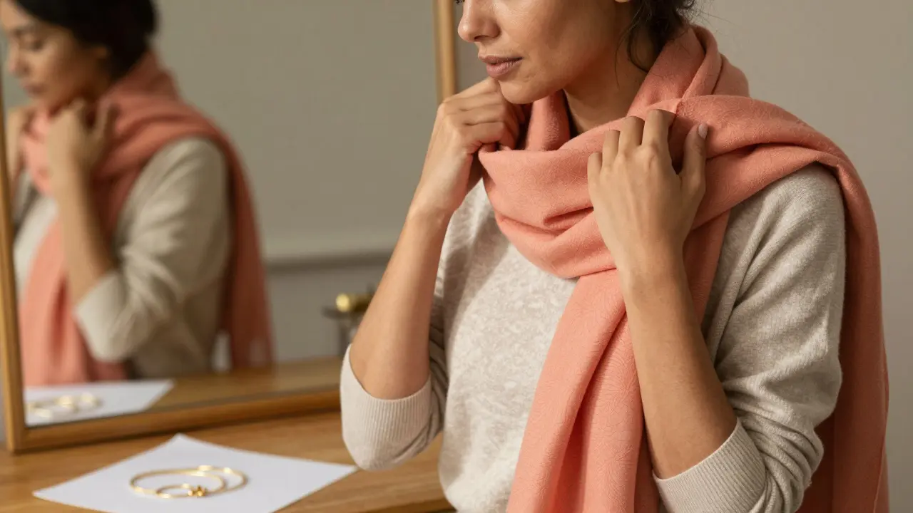
Let’s say you’re a Winter (cool, deep, high-contrast coloring). Your best colors are true black, icy white, royal blue, and ruby red. This season’s trend is peachy coral. On its own, coral might clash with your cool undertones. But if you wear coral as a scarf, a handbag, or even a pair of shoes? Suddenly, it becomes an accent-not a full outfit. It adds a pop of trend without overwhelming your natural contrast.
On the flip side, if you’re a Spring (warm, light, bright), you might love the new Lime Zest trend. But if you wear it head-to-toe, you risk looking like a citrus fruit. Instead, try a lime green blouse under a neutral beige blazer. The trend stays visible, but your personal palette keeps you grounded.
How to Blend Them Without Looking Like a Rainbow
Here’s a simple rule: 70/30 balance. Seventy percent of your outfit should come from your personal palette. Thirty percent can be trend-driven. That means:
- If you’re wearing a coral dress (trend), pair it with neutral black or navy shoes and jewelry (personal).
- If you’re drawn to the new slate blue coat (trend), wear it over your usual warm-toned sweaters (personal).
- Use accessories to test trends: scarves, belts, handbags, socks, or even nail polish.
Another trick: look at the color’s intensity. If the trend color is highly saturated (like electric lime), use it sparingly. If it’s muted (like Soft Linen), it’s easier to integrate. Muted tones often bridge personal and seasonal palettes naturally.
Try this: lay out your favorite clothes on the bed. Now, lay out one trend item from this season. Which of your clothes does it pair with? If it clashes with everything, skip it. If it harmonizes with one or two items, you’ve found your entry point.
Common Mistakes to Avoid
People make the same errors over and over:
- Buying a whole new wardrobe based on trends. Result? A closet full of clothes you never wear.
- Assuming your seasonal color category is permanent. Undertones can shift slightly with age, sun exposure, or health changes. Re-evaluate every 3-5 years.
- Ignoring lighting. Colors look different in natural daylight, fluorescent store lights, and indoor lamps. Test colors near a window before buying.
- Letting influencers dictate your palette. Just because a celebrity wears a color doesn’t mean it works for you. Their lighting, makeup, and skin treatments are professionally done.
One woman in Brooklyn, 42, told me she spent $800 on a ‘must-have’ coral coat last spring. She wore it once. This year, she got a personal color analysis for $120. She now owns three coats-all in her true palette-and wore one of them with a trend accessory last week. She looked better than ever.

How to Find Your Personal Palette (Without a Pro)
You don’t need a $300 consultation to start. Here’s a DIY method:
- Wash your face. No makeup. Natural light only.
- Hold a white sheet of paper next to your face. Does your skin look more yellow/gold (warm) or pink/blue (cool)?
- Try on gold and silver jewelry. Which one makes your skin look brighter? Gold usually suits warm tones. Silver suits cool tones.
- Look at your veins. Are they greenish? You’re likely warm. Bluish? You’re likely cool.
- Test colors: wear a cream top and a white top. Which makes your skin look more even? Cream often flatters warm tones. White flatters cool.
Once you know your undertone, match it to these general guidelines:
| Undertone | Best Colors | Colors to Avoid |
|---|---|---|
| Warm (Golden, Peach) | Earth tones, mustard, coral, olive, terracotta | Neon pink, icy blue, pure white |
| Cool (Pink, Red, Blue) | True red, navy, emerald, plum, icy pastels | Orange, brown, gold, warm beige |
| Neutral | Muted tones, taupe, charcoal, soft gray, dusty rose | Overly bright or overly dull shades |
Real-Life Examples from New York
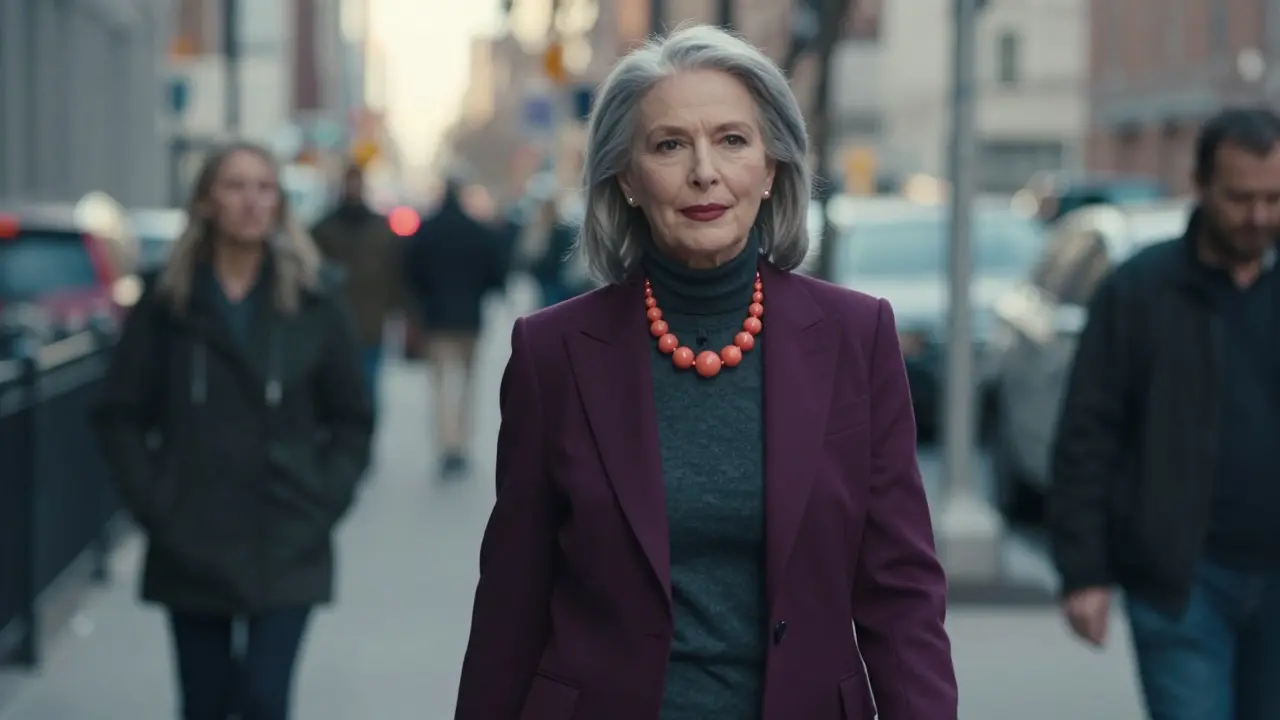
I’ve seen this play out in cafés, subways, and parks here. A woman in her 50s with silver hair and fair skin (cool undertone) wore a deep plum blazer over a charcoal turtleneck. She added a single coral statement necklace-this season’s trend. She looked polished, modern, and effortlessly put together.
Another man, early 30s, with olive skin and dark hair (warm undertone), wore a slate blue suit. He paired it with a mustard tie and brown loafers. The suit was trendy. The tie and shoes were his personal palette. He didn’t look like he was trying too hard-he looked like he knew what worked.
Color isn’t about following rules. It’s about harmony. When your clothes work with your skin, not against it, you don’t just look better. You feel more confident. You walk taller. You stop second-guessing.
Final Thought: Trends Come and Go. Your Palette Doesn’t.
Seasonal color trends change every six months. Your skin tone? It stays the same. That’s your advantage. You don’t need to chase every hue. You just need to know which ones to let in.
Use trends like spices-not the whole meal. A pinch of coral. A whisper of lime. A brush of slate. Let them enhance your natural palette, not overwrite it. The goal isn’t to look like a magazine spread. It’s to look like the best version of yourself.
Can my personal color palette change over time?
Yes, but rarely. Your undertone stays mostly stable, but factors like aging, sun exposure, or even health changes (like thyroid issues or vitamin deficiencies) can shift how colors interact with your skin. If you notice that colors you once loved now make you look tired, it might be time for a quick refresh. A simple mirror test in natural light can help-no need for a full analysis unless you’re unsure.
What if I love a color that’s not in my palette?
You can still wear it. Just don’t wear it close to your face. A red dress might clash with your cool undertones, but a red handbag or shoes? That’s fine. Use trend colors as accents, not anchors. This way, you honor your preference without sacrificing harmony.
Do I need to buy new clothes every season?
No. In fact, buying less is smarter. Focus on building a core wardrobe in your personal palette. Then, add one or two trend items per season. A scarf, a pair of earrings, or a belt can update your look without a full closet overhaul.
Is personal color analysis just a myth?
No. It’s based on color theory and human perception. Studies from the Fashion Institute of Technology and the University of Kansas show that people perceive themselves as more attractive and confident when wearing colors that match their natural coloring. It’s not magic-it’s science. Your skin reflects certain wavelengths of light. Certain colors enhance that reflection. Others mute it.
Can men benefit from personal color analysis?
Absolutely. Men often overlook color, thinking it’s just for women. But a suit that flatters your skin tone makes you look sharper, more energetic, and more put-together-even without accessories. A warm-toned man in a navy suit looks more vibrant than one in black. A cool-toned man in charcoal looks more polished than in brown. Color works for everyone.
If you’re ready to stop guessing and start looking like yourself, start with one item. Try a trend color as an accessory. See how it feels. Then, compare it to your favorite neutral. You’ll know the difference instantly. Trust your eyes-not the trend report.


Write a comment