

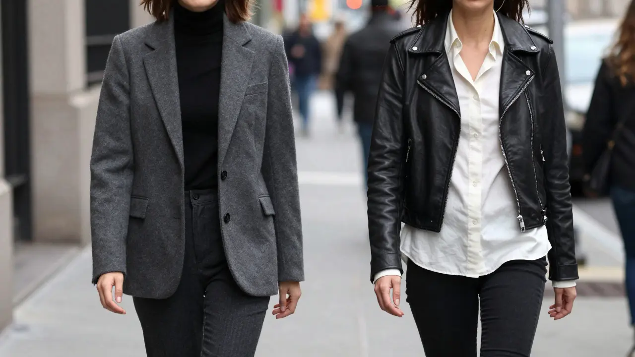
Walking down a busy street in New York, you might notice two people wearing all-black outfits. One looks effortlessly chic and elongated; the other feels flat or even muddy. The difference? It’s not about the clothes themselves, but how the shades interact. This is where tonal dressing gets interesting. It’s not just wearing one color-it’s mastering the distance between light and dark within that single hue.
Many people think monochrome means boring. But when you understand the spectrum of contrast, you unlock two completely different aesthetic tools. Low-contrast tonal dressing creates a soft, cohesive blur that flatters almost every body type. High-contrast monochrome adds edge, definition, and visual punch. Knowing which one to use depends on your goal, your skin tone, and the vibe you want to project.
Understanding the Spectrum of Contrast
To get this right, you first need to define what we mean by contrast in fashion. In design terms, contrast refers to the difference in value (lightness or darkness) between adjacent elements. When applied to clothing, it dictates how distinct each garment appears from the next.
Low-contrast tonal dressing involves using shades that are very close in value. Think of pairing a charcoal grey blazer with a black turtleneck. They are both dark, so the eye glides over the outfit without stopping at the seams. This technique is often associated with minimalism and quiet luxury. It relies on texture differences-like wool against silk-to create interest rather than color shifts.
High-contrast monochrome, on the other hand, uses the full range of a single color family. You might pair a jet-black leather jacket with an off-white cotton shirt. Here, the stark difference in value creates a sharp line where the garments meet. This approach draws attention to the silhouette and makes specific pieces stand out. It’s bolder, more graphic, and requires precise tailoring to look polished.
The Psychology of Soft Cohesion
Why do low-contrast outfits feel so calming? Human eyes are naturally drawn to edges and boundaries. When those boundaries are blurred by similar values, the brain processes the outfit as a single, unified shape. This has a direct effect on perception.
- Elongation: Without hard lines breaking up the torso or legs, the vertical line of the body appears longer. This is why all-navy or all-beige outfits are go-to choices for anyone wanting to look taller.
- Simplicity: The lack of visual noise reduces cognitive load. The observer doesn’t have to parse multiple competing elements, making the wearer appear composed and confident.
- Timelessness: Because there are no bold clashes, these outfits rarely date. A camel coat over a taupe sweater will look just as good in ten years as it does today.
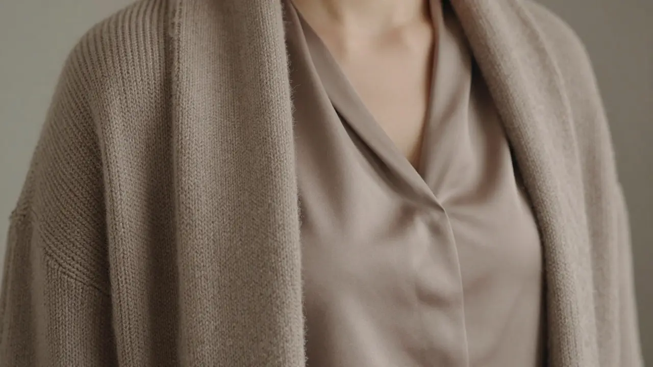
This style works best when you prioritize fabric quality. Since color isn’t doing the heavy lifting, texture becomes your primary tool. Pairing a rough knit with a smooth satin blouse in the same shade of brown creates depth without disrupting the flow.
The Power of Sharp Definition
High-contrast monochrome is the opposite strategy. It uses the gap between light and dark to create structure. If low-contrast is a whisper, high-contrast is a statement.
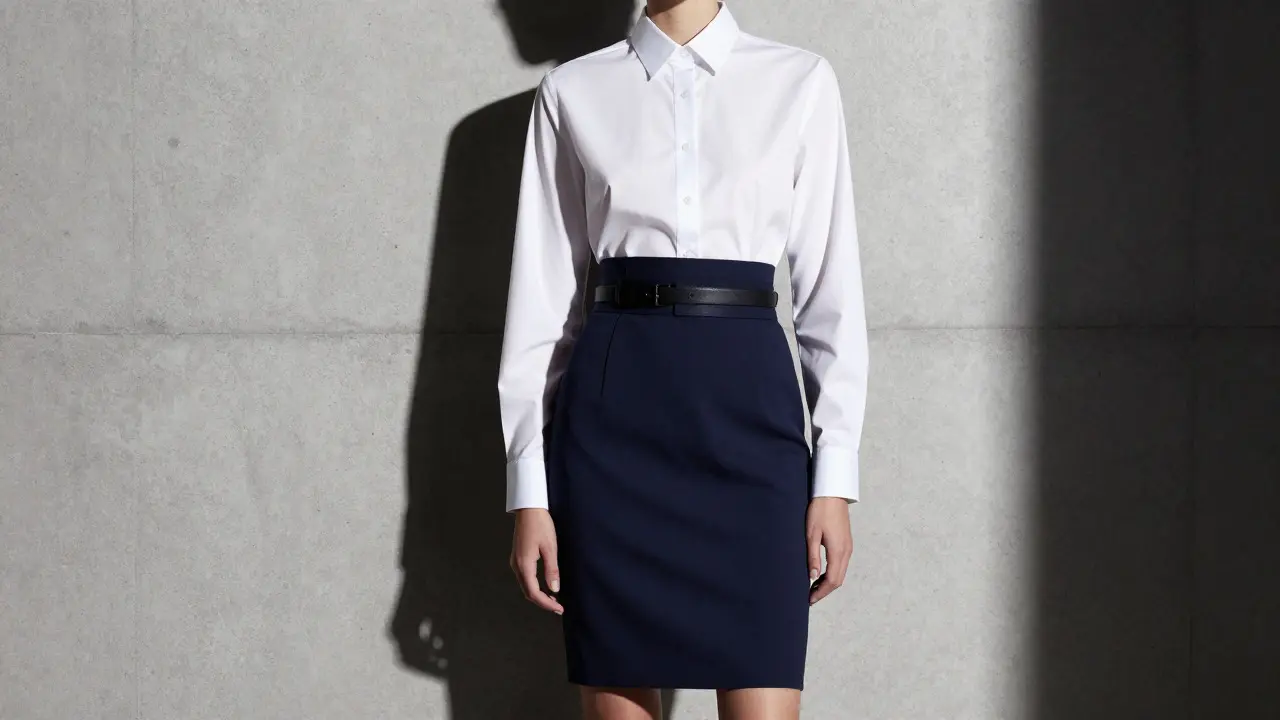
This technique is particularly effective for highlighting specific areas of the body. For example, wearing a bright white top under a deep navy skirt creates a horizontal line at the waist. If you want to emphasize your midsection, this is your move. Conversely, matching a dark top with a dark bottom while keeping the shoes light can draw the eye upward, balancing proportions.
However, high-contrast carries a risk. If the transition between light and dark is abrupt and unbalanced, it can make the wearer look segmented or disjointed. To avoid this, you need strong lines in your clothing. Structured shoulders, crisp collars, and clean hems help anchor the contrast so it looks intentional rather than accidental.
Choosing Your Palette: Beyond Black and White
While black and white are the most common examples, tonal dressing works with any hue. The key is understanding how your skin undertone interacts with the chosen color.
| Feature | Low-Contrast Tonal | High-Contrast Monochrome |
|---|---|---|
| Visual Effect | Cohesive, elongating, soft | Defined, structured, bold |
| Best For | Everyday wear, office settings, subtle elegance | Evening events, creative industries, statement looks |
| Key Challenge | Avoiding looking flat or muddy | Avoiding looking segmented or harsh |
| Texture Role | Critical for adding depth | Secondary to color value difference |
| Flattering Body Types | Most body types, especially petite frames | Those who want to highlight specific features |
If you have cool undertones, blues, greys, and purples will make your skin look luminous in both low and high contrast versions. Warm undertones shine in earth tones like rust, olive, and camel. Neutral undertones can pull off almost anything, giving you the freedom to experiment with both strategies freely.
Practical Styling Tips for Daily Wear
You don’t need a designer closet to master these techniques. Here are some actionable ways to incorporate them into your existing wardrobe.
- Start with Neutrals: Begin with beige, grey, or navy. These colors are forgiving and easy to find in varying shades. Buy a base layer in a mid-tone and add outerwear in a darker shade for low contrast, or a lighter shade for high contrast.
- Mix Textures Deliberately: For low-contrast looks, ensure at least two different fabrics are present. A linen shirt under a wool cardigan in the same shade prevents the outfit from looking like a uniform.
- Use Accessories to Bridge Gaps: If you’re struggling with high contrast, use accessories to soften the transition. A scarf in a mid-tone between your top and bottom can tie the look together.
- Check the Lighting: Always try on tonal outfits in natural light. Store lighting can wash out subtle differences, making a low-contrast outfit look too dark or a high-contrast one look too harsh.
One common mistake is assuming that “matching” means identical. True tonal dressing allows for variation. A slate blue dress paired with a steel blue blazer is tonal. A navy suit with a black shirt is also tonal, provided the values are balanced.
Common Pitfalls to Avoid
Even experienced stylists can stumble when working with monochrome palettes. The biggest trap is ignoring fit. In low-contrast outfits, poor fit is magnified because there are no color breaks to distract the eye. If your trousers are too long or your jacket is too tight, it will be obvious immediately.
In high-contrast looks, the pitfall is usually balance. If the upper half is very light and the lower half is very dark, you risk looking top-heavy. Adjust by choosing footwear that matches the darker element to ground the look, or by adding a belt to define the waistline clearly.
Another error is neglecting maintenance. Lighter shades in high-contrast outfits show stains and wrinkles more easily. Darker shades in low-contrast outfits can accumulate lint and dust. Regular steaming and spot cleaning keep these sophisticated looks fresh.
Frequently Asked Questions
Is tonal dressing only for neutral colors?
No. While neutrals like beige, grey, and navy are the easiest to work with, you can do tonal dressing with any color. For example, pairing a bright red lipstick with a coral top and a salmon blush is a form of tonal dressing in makeup. In clothing, you could pair a mustard yellow shirt with a golden-brown blazer. The key is staying within the same color family or analogous hues.
Which contrast level is better for small frames?
Generally, low-contrast tonal dressing is more flattering for smaller frames because it creates an uninterrupted vertical line, making the body appear taller and leaner. High-contrast looks can sometimes cut the body into sections, which may shorten the appearance if not balanced carefully with proper proportions.
How do I know if my shades are close enough for low contrast?
Hold the two garments up in natural daylight. If you can easily distinguish the difference between the two fabrics from three feet away, they might be too far apart for a strict low-contrast look. For true low contrast, the shades should be subtle enough that the distinction is felt more than seen, relying on texture to provide the visual interest.
Can I mix patterns in a monochrome outfit?
Yes, but with caution. For low-contrast looks, use patterns that share the same background color as your solid pieces. For high-contrast looks, ensure the pattern includes both the light and dark values of your palette to maintain cohesion. Avoid mixing large-scale prints with small-scale ones unless you are confident in balancing the visual weight.
Does high-contrast monochrome look formal?
It can look very formal, depending on the fabrics and cuts. A black tuxedo jacket with a white shirt is the ultimate high-contrast formal look. However, high-contrast can also be casual, such as a white tee with black jeans. The context of the occasion and the quality of the materials determine the formality level.


Write a comment