Ever bought a shirt that looked perfect in the store, only to realize it washed you out at home? You’re not alone. Most people think color analysis is complicated-something only stylists or makeup artists understand. But here’s the truth: there are a handful of universal colors that flatter nearly every seasonal type, if you tweak them just right for your season. You don’t need a $300 draping session to find your best shades. You just need to know which colors work for everyone, and how to adjust them.
What Really Makes a Color Flattering?
Flattering colors don’t just match your hair or eye color. They work with your skin’s undertone, its natural contrast level, and how light or dark your coloring is. That’s the core of seasonal color analysis. There are four main seasons-Winter, Summer, Spring, and Autumn-each with subtypes like Soft Summer or Deep Autumn. But here’s the thing: no matter your season, your skin reacts to the same three things: warmth, coolness, and saturation.
Think of it like this: if you wear a color that’s too muted for your contrast, you look tired. If it’s too bright for your undertone, you look sickly. The right color doesn’t scream-it harmonizes. And there are five colors that do this across nearly all seasons, if you adjust their brightness or depth.
The Five Universal Flattering Colors
These five colors show up in almost every seasonal palette-not because they’re magical, but because they balance warmth and coolness in a way that works for most people.
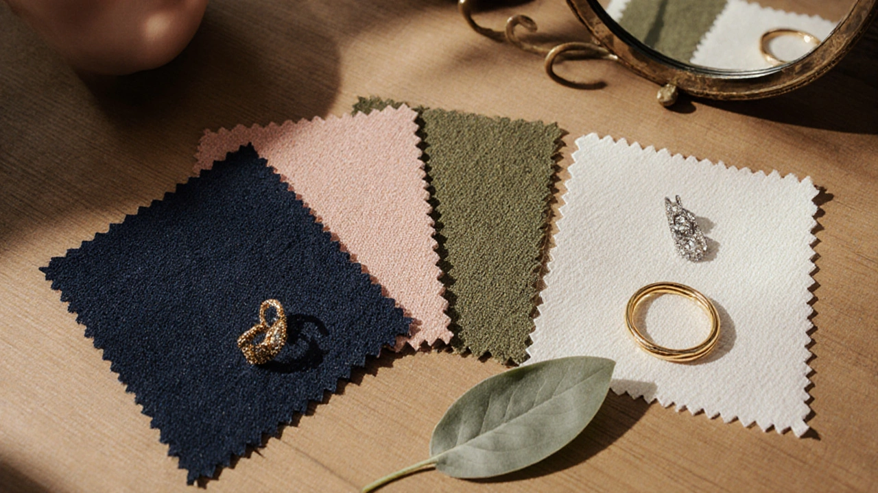
- True Navy - Not black, not charcoal. Real navy, like the deep blue of a clear night sky. It’s dark enough to add contrast without swallowing you up.
- Soft Rose - Not hot pink, not peach. A quiet, slightly grayed pink that sits between warm and cool. Think dried rose petals, not candy.
- Warm Olive Green - Not neon green, not forest green. A muted, earthy olive with a hint of yellow. It’s the color of sage leaves or moss after rain.
- Soft White - Not stark white. Not cream. A gentle, off-white with a touch of gray or beige. It’s what you see in linen or unbleached cotton.
- Light Taupe - Not beige, not gray. A neutral that’s just warm enough to feel alive but cool enough to stay calm. Like weathered wood or fine sand.
These five colors are the foundation. Now let’s break down how to tweak them for each season.
Winter: High Contrast, Cool Edge
Winters have bold contrast-dark hair, light skin, or vice versa. They look best with crisp, clear colors. But even Winters can wear the universal colors if they’re sharpened.
- Navy → Go for true navy with no hint of black. Avoid anything too soft. Try navy with a hint of blue-violet for Extra Winter types.
- Rose → Use a cooler, brighter rose. Think raspberry with a touch of blue. Avoid anything too pink or peachy.
- Olive Green → Skip it unless it’s very dark and cool. Opt for deep forest green instead. Olive can look muddy on true Winters.
- Soft White → Use a pure, icy white. No yellow or cream tones. This is your go-to for contrast.
- Taupe → Choose a taupe with a gray base. Avoid anything warm. Think charcoal-gray mixed with a whisper of brown.
Winters can wear these colors confidently because they’re already high-contrast. The trick is keeping them sharp and cool.
Summer: Soft, Cool, and Gentle
Summers have cool undertones and low contrast. Think pale skin, ash-blonde or dark gray hair, and soft eyes. They look washed out by anything too bright or warm.
- Navy → Go for a muted navy. Add a touch of gray. Think steel blue-gray rather than pure navy.
- Rose → Perfect as-is. Soft Rose is made for Summers. Avoid any orange or coral tones.
- Olive Green → Use a cool, grayed olive. Think slate green or cool moss. Warm olive will make you look sallow.
- Soft White → Your best friend. Keep it cool, with a hint of blue or lavender. Never use cream or ivory.
- Taupe → Use a cool taupe with gray undertones. Avoid anything yellow-based. Think dusty slate or ash-gray brown.
Summers thrive on subtlety. These five colors, when softened and cooled, become their secret armor against looking washed out.
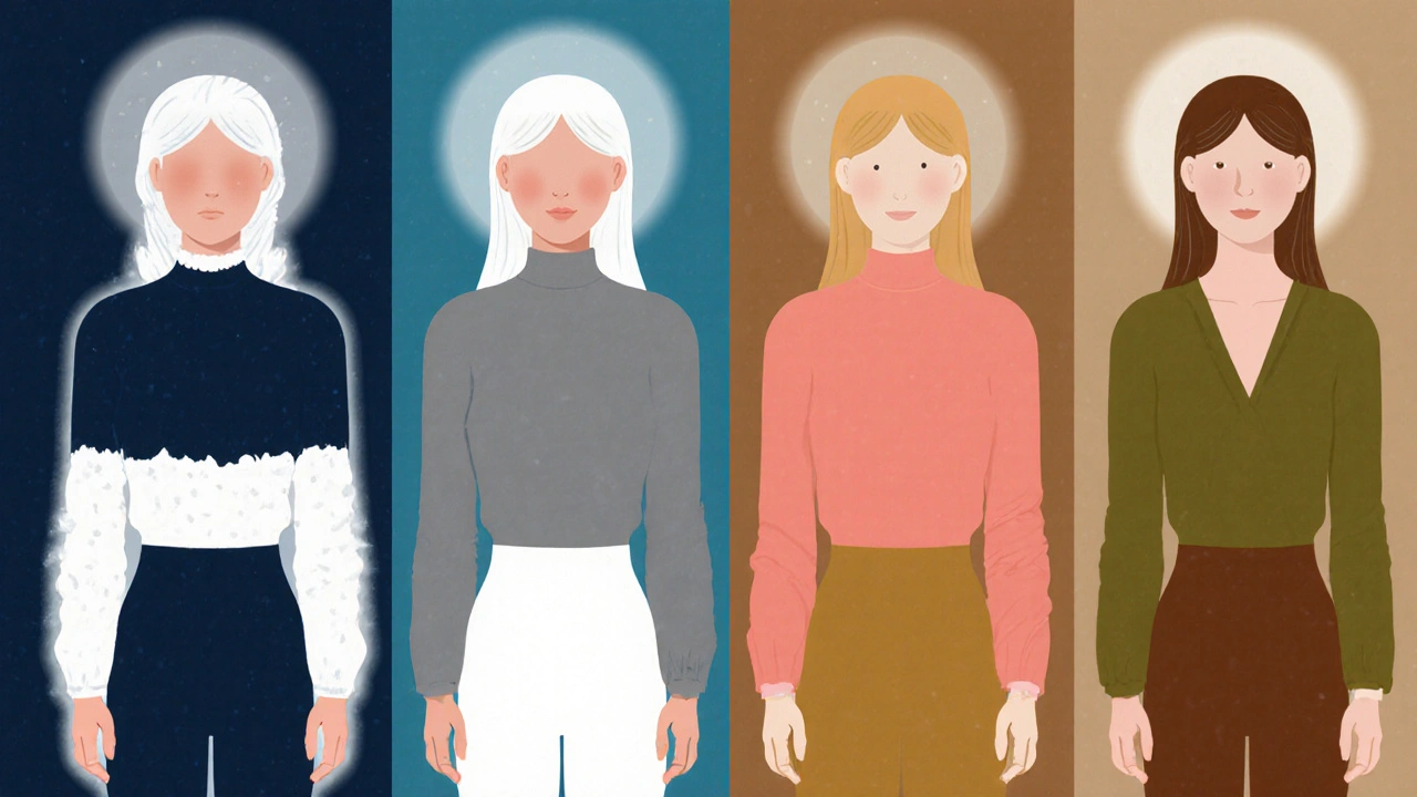
Spring: Warm, Bright, and Alive
Spring types have warm undertones and usually bright, light coloring-think golden skin, honey-blonde hair, and green or hazel eyes. They need color that feels fresh, not dull.
- Navy → Too heavy. Swap for teal or royal blue instead. If you must wear navy, pick one with a greenish tint.
- Rose → Make it warmer. Add a touch of peach. Think peach-pink or coral-rose. Avoid grayed pinks.
- Olive Green → Perfect. Use a warm, slightly yellow olive. Think new leaf green or golden sage.
- Soft White → Swap for cream or ivory. Pure white looks cold on Springs. Warm white brings out their glow.
- Taupe → Use a warm taupe with golden undertones. Think light caramel or toasted almond. Avoid gray.
Spring’s magic is in brightness. These five colors become their allies when warmed up and lifted.
Autumn: Rich, Warm, and Earthy
Autumns have deep, warm undertones-think golden skin, auburn or chestnut hair, and brown or amber eyes. They look best in colors that feel grounded and rich.
- Navy → Too cool. Use dark brown or deep burgundy instead. If you wear navy, make sure it’s warm-like a brownish navy.
- Rose → Too pale. Swap for terracotta, brick red, or rust. Warm, muted reds are your friends.
- Olive Green → Your superstar. Use a deep, golden olive. Think burnt olive or dark moss.
- Soft White → Too cold. Use cream, beige, or warm ivory. White makes you look dull.
- Taupe → Perfect. Use a rich, warm taupe with brown and gold in it. Think dark caramel or umber.
Autumns don’t need to change much. These colors are already in their wheelhouse-just deepen and warm them up.
How to Test These Colors at Home
You don’t need a professional to test these. Here’s how to do it yourself:
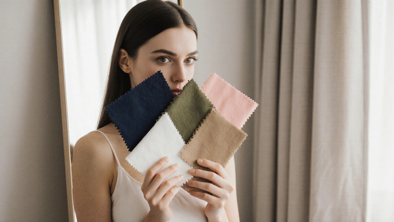
- Wear a white t-shirt and natural daylight (not fluorescent or indoor lighting).
- Hold up fabric swatches of each universal color: navy, soft rose, olive green, soft white, taupe.
- Look at your face in a mirror. Do your eyes look brighter? Does your skin glow or look dull?
- Take a photo with your phone. Compare the images side by side. The color that makes your eyes pop and your skin look even is your match.
Don’t overthink it. If a color makes you look more rested, more awake, and more like yourself-you’ve found your winner.
Common Mistakes to Avoid
Even with universal colors, people still mess up.
- Wearing black instead of navy - Black kills contrast on most people. Navy gives depth without crushing you.
- Using cream instead of soft white - Cream is warm. If you’re a Summer or Winter, it yellows your skin.
- Choosing bright pink for Autumn - Bright pinks look jarring on warm, deep skin. Go for rust, not bubblegum.
- Thinking “neutral” means beige - Beige is a trap. It’s too vague. Taupe has structure. Beige has none.
- Ignoring undertone - If your skin looks greenish under fluorescent lights, you’re cool. If it looks yellow, you’re warm. This changes everything.
Why This Works Better Than Traditional Color Analysis
Traditional seasonal systems can be overwhelming. You’re told you’re a “Soft Autumn” and then you can’t wear red, green, or navy. But real life doesn’t work that way. You need a capsule wardrobe that works across seasons and moods.
This system gives you five anchor colors that work for everyone. Then you tweak them slightly based on your season. It’s not about rules-it’s about harmony. You’re not locked into a palette. You’re given a toolkit.
Most people who get color analysis end up buying five shirts and never wearing them again. With this method, you build a wardrobe that lasts. You can mix, match, layer, and repeat without stress.
Final Tip: Build Your Core Palette
Start with these five universal colors. Then add one or two seasonal-specific accents.
For example:
- Winter: navy, soft white, taupe, rose, and add electric blue as your pop.
- Summer: soft white, taupe, rose, navy, and add lavender gray.
- Spring: soft white, taupe, olive green, rose, and add coral.
- Autumn: taupe, olive green, rose (warm), and add burnt orange.
You now have a core of five colors that work for you, plus one accent that screams your season. That’s it. That’s your entire wardrobe foundation.
No more guessing. No more wasted money. Just clothes that make you look like the best version of yourself-every single day.
Can I wear black if I’m not a Winter?
Black can work for non-Winters, but it’s risky. It flattens contrast and can make skin look dull or gray. Navy is a safer, more flattering alternative for most seasons. If you love black, try pairing it with a warm neutral like taupe or olive to soften its impact.
What if my hair and eyes are different seasons?
Your skin tone is the most important factor. Hair and eye color change with lighting and dye, but your undertone stays consistent. Focus on how colors look on your face and neck. That’s where the real impact happens.
Do I need to buy all new clothes?
No. Look at what you already own. Try on your top five pieces with a soft white shirt and natural light. Which ones make you glow? Those are your keepers. You don’t need to start over-just refine.
Can I wear these colors in winter?
Absolutely. These colors work year-round. In winter, layer them with textures-wool, cashmere, velvet-to add depth. Soft rose over a navy coat looks elegant. Olive green with a taupe scarf feels grounded. Seasonal color isn’t about weather-it’s about harmony.
Is there a quick way to know my season?
Look at your veins under natural light. If they look blue, you’re likely cool. If they look green, you’re likely warm. Then ask: do you look better in silver or gold jewelry? Silver suits cool tones. Gold suits warm tones. That’s your starting point.


Write a comment